I ♥︎ BRAND DESIGN
I ♥︎ BRAND DESIGN
Welcome to my portfolio overview page.
I’m so glad you’re here!
Please take a look around, and get in touch if you’d like to discuss how we could work together.

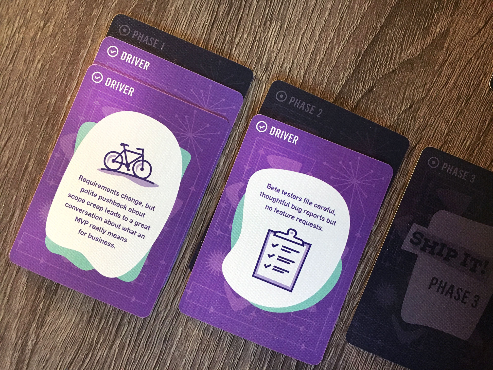
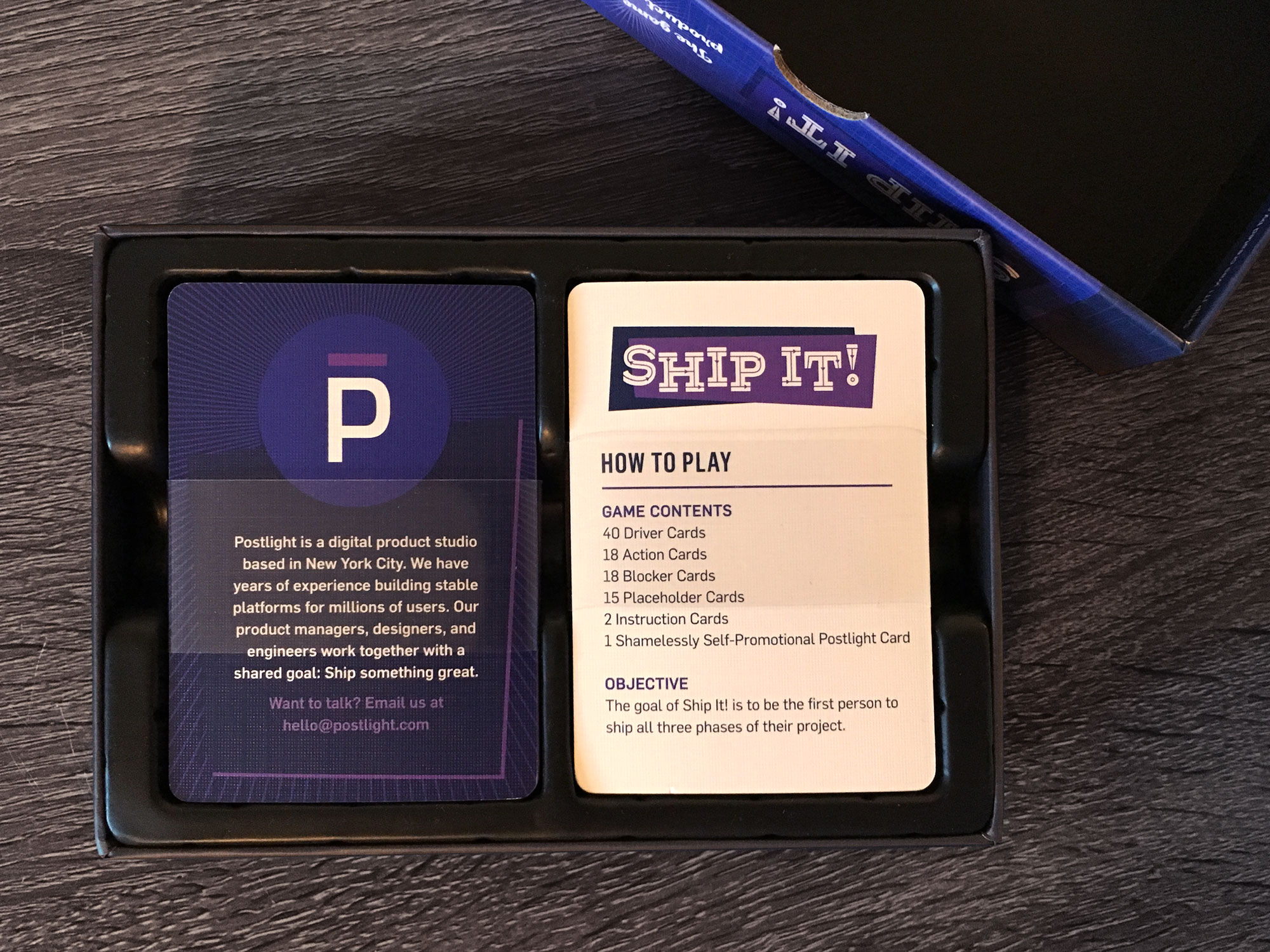
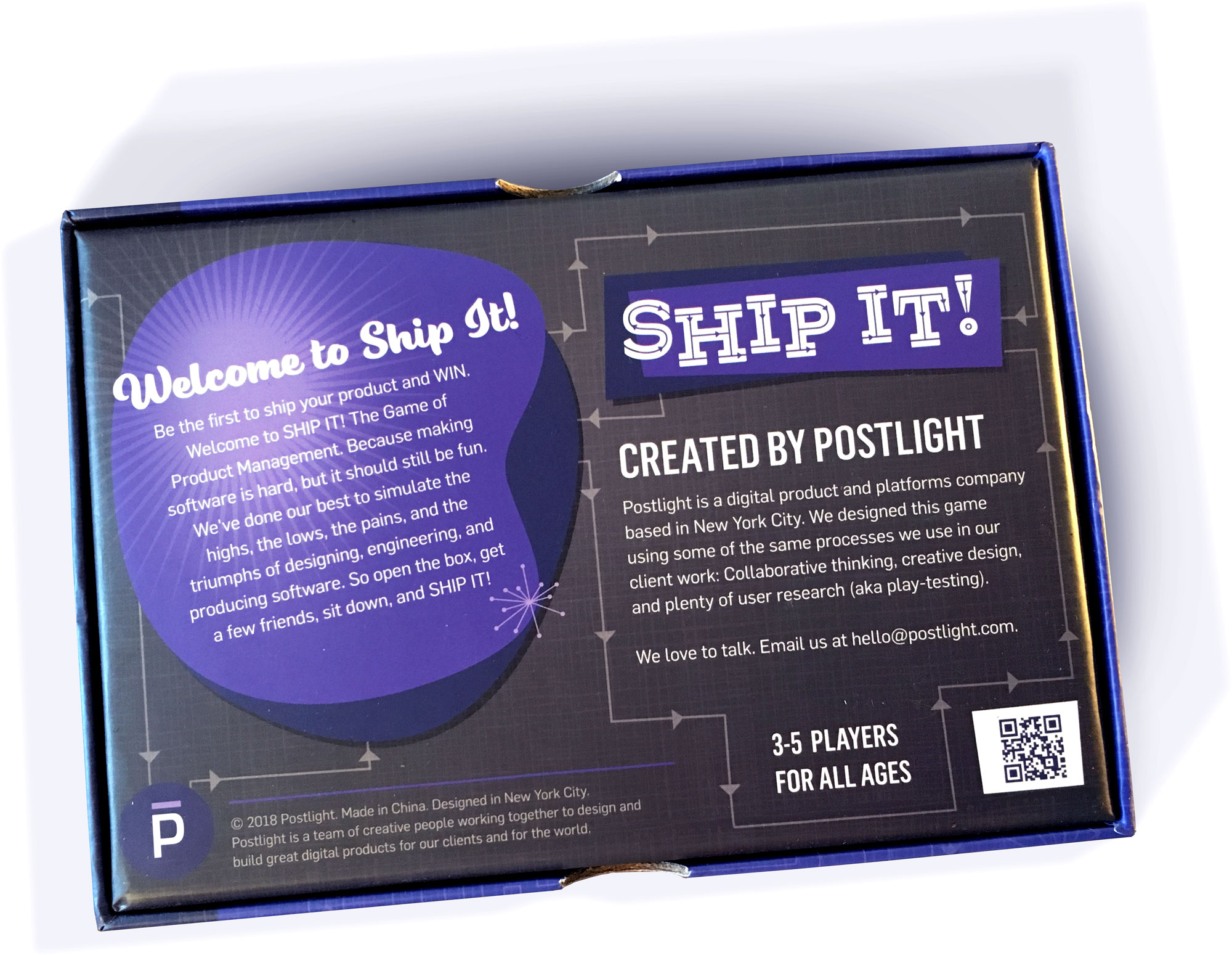
Ship It! The Game of Product Management
Ship It! was one of my favorite projects I worked on for Postlight. This is a product design-themed card game, used as a promotional item for current and prospective clients. I completed all the design and illustration work on this whole project, which included game cards, packaging, promo inserts, digital collateral, and event collateral. I was also involved in designing and testing the gameplay mechanics.
-
Postlight, a digital product studio in New York City.
-
Graphic design, illustration, packaging design, logistics, game design.
-
Stephen Carlson, designer
Paul Ford, copywriter
Xarissa Holdaway, copywriter
Meredith Franzese, operations
A handful of people for game design testing


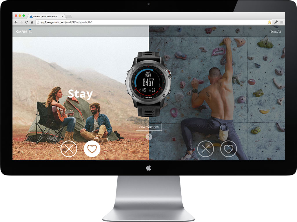
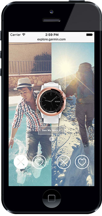
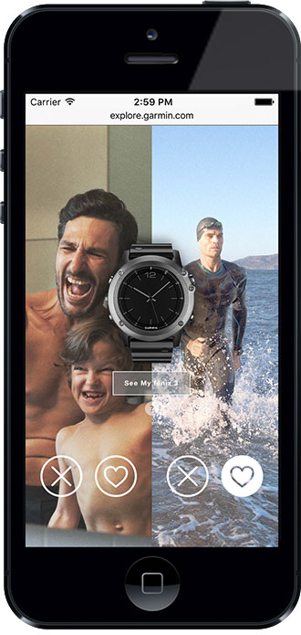
Garmin fenix Campaign – Find Your Both
This is an interactive microsite I designed based on the “Find Your Both” campaign for the Garmin fenix fashion / outdoor GPS watch. The fenix was positioned as a refined timepiece for the modern man, and a smart GPS watch for his more adventurous side. The goal of this microsite was to generate customer engagement with the campaign, while visualizing the dual-nature aspect of the watch. On this site, users can vote each image up or down, based on their own personal taste. When the user has finished choosing photos, the website will present which version of the watch is right for them.
-
Garmin, a leader in GPS technology and wearable devices.
-
Digital design
-
Stephen Carlson, designer
John McEown, art director
Tom Patten, copywriter
1 software engineer


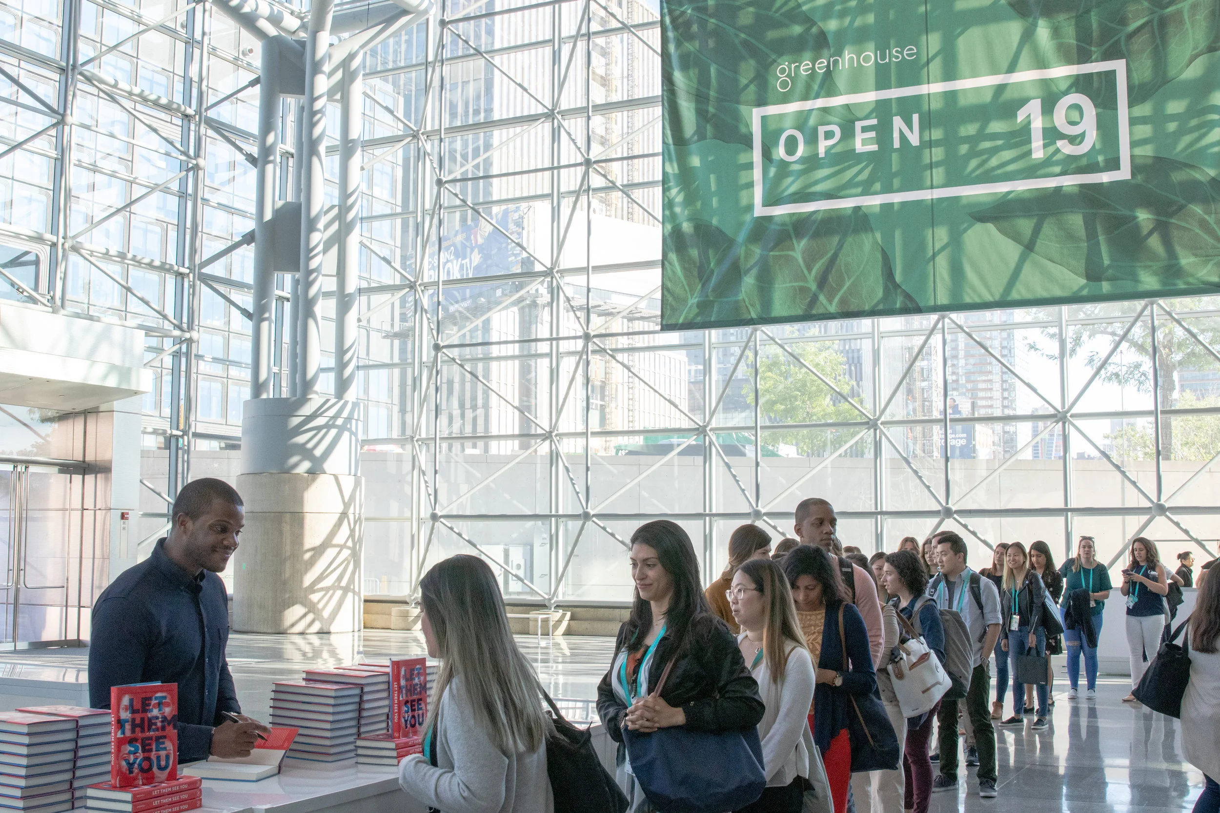
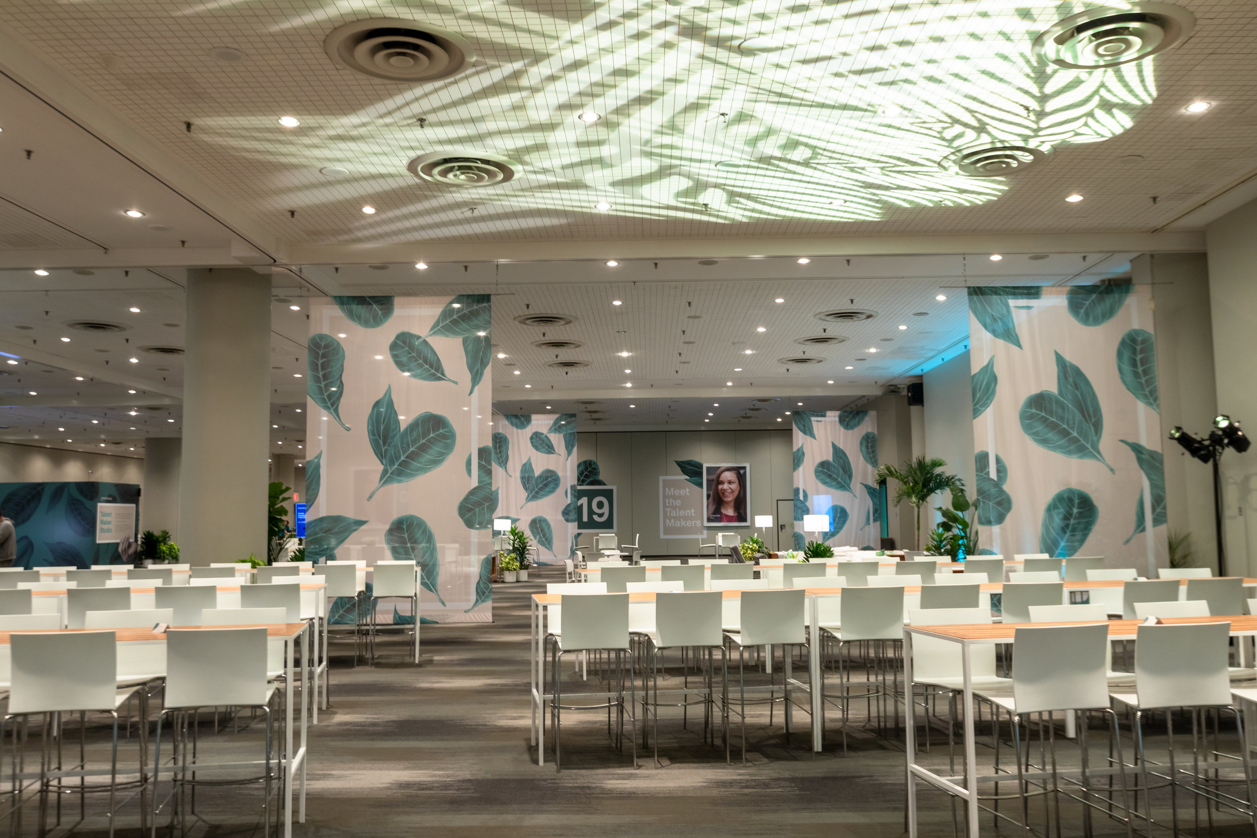
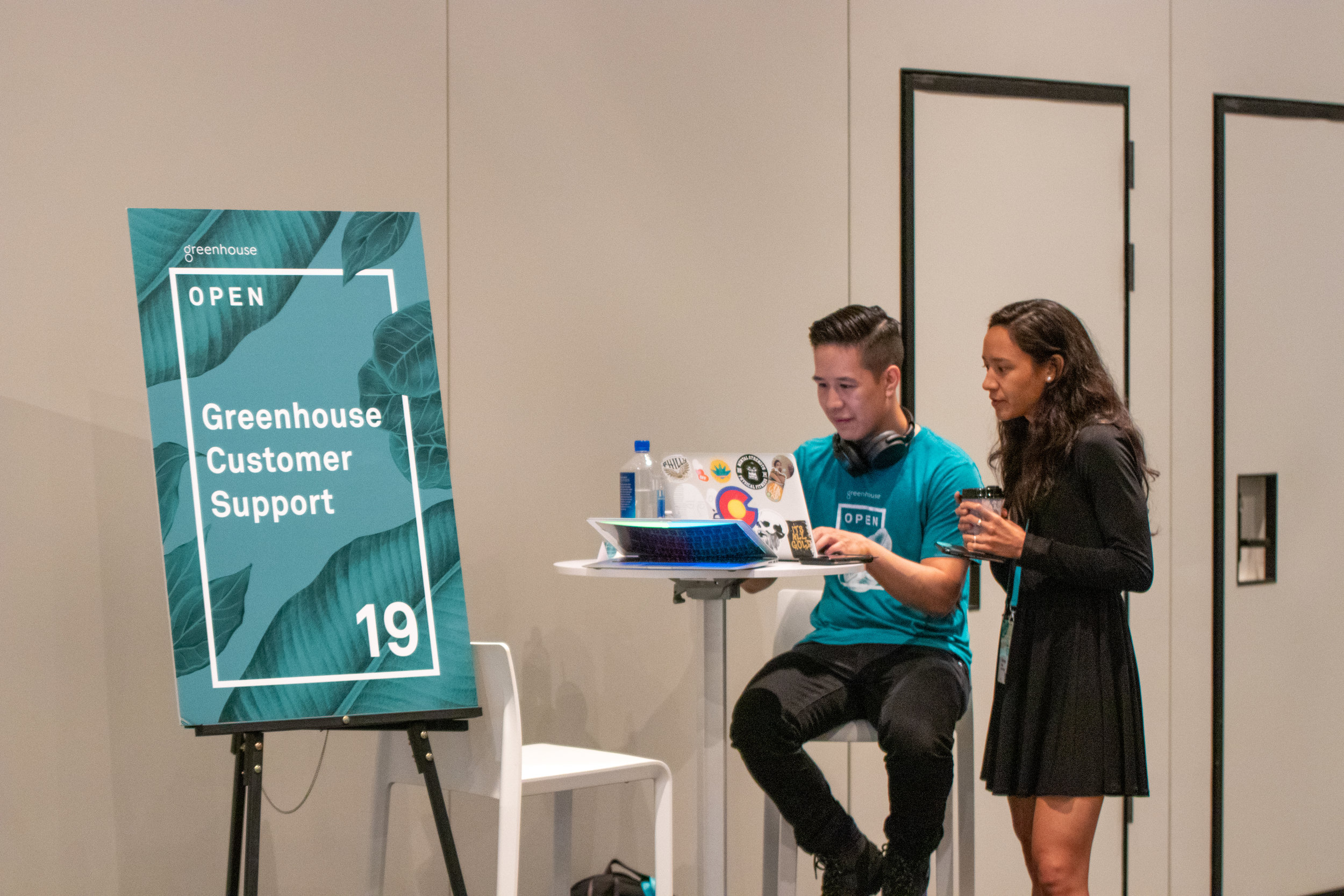
Greenhouse OPEN
Greenhouse OPEN is an annual conference for HR professionals focused on helping business leaders attract and retain great talent in their organizations. Along with a Creative Director and another designer, I helped design the branding and collateral for this year’s event. This conference took place at the Jacob Javits center in New York City, and was attended by over 1000 professionals. Some items I worked on included general event branding, wayfinding signage, welcome signage, t-shirts, app design, marketing collateral, digital design, and more.
-
Greenhouse, a provider of HR recruiting software for talent acquisition.
-
Design and art direction
-
Stephen Carlson, designer
Eunice Hong, designer
Trenton Kenagy, creative director


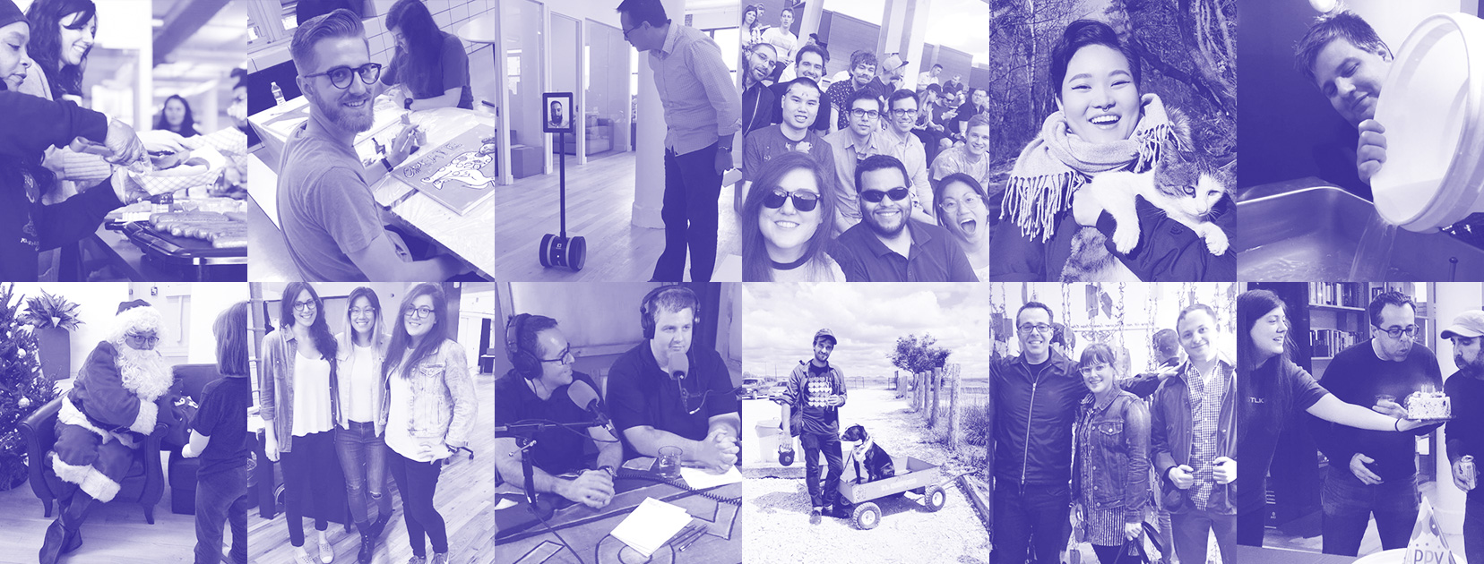
Postlight Brand Design
At Postlight, I was responsible for all internal brand and marketing design. An important part of that responsibility was maintaining consistency of the existing visual language, while continuing to explore new ways that the Postlight brand could evolve, as the company grew.


Mercury Brand Design


Postlight Socks


Postlight Track Changes Blog
While at Postlight, we redesigned our popular Track Changes blog while also migrating all the content from Medium to our own Postlight domain. I created all the blog article illustrations, while also provided light support for the design of the new blog itself.


Justworks Blog Redesign
As our marketing needs grew to include more articles, news, and gated content, our current blog was not getting the job done. I redesigned the Justworks blog in order to help the marketing team have more control over how content was promoted and featured, as well as giving the site a much-needed visual design refresh to bring things up to standard with the rest of the Justworks brand. In addition to designing the blog itself, I also created a visual identity for Justblog, which is a sub-brand for the blog itself.


Icon Library and Badges


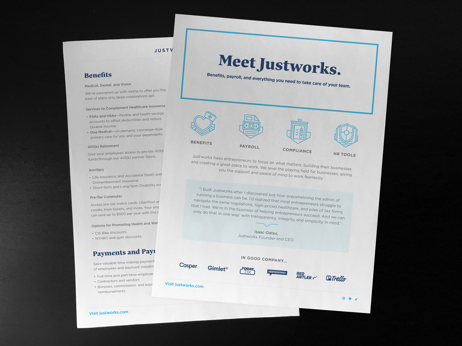
Justworks Overview Explainer
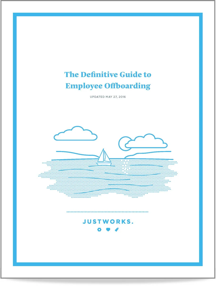
Whitepapers


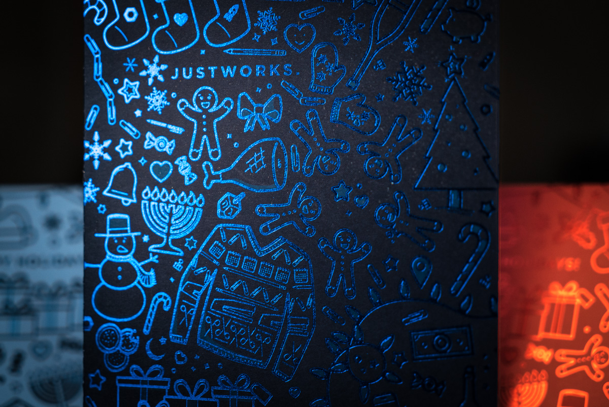
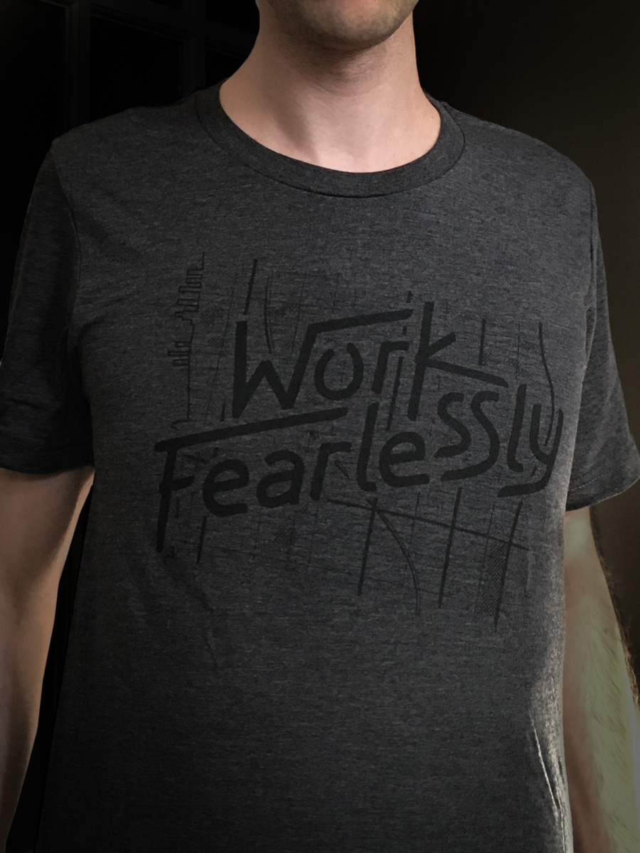
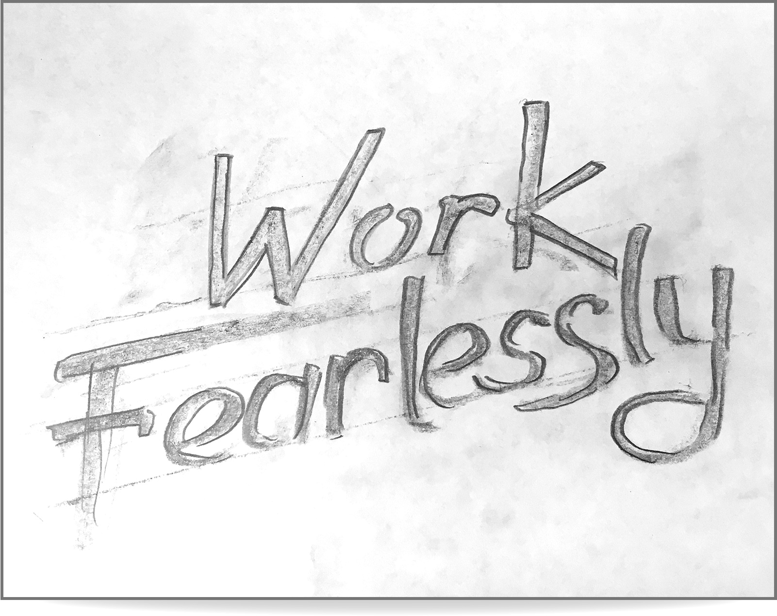
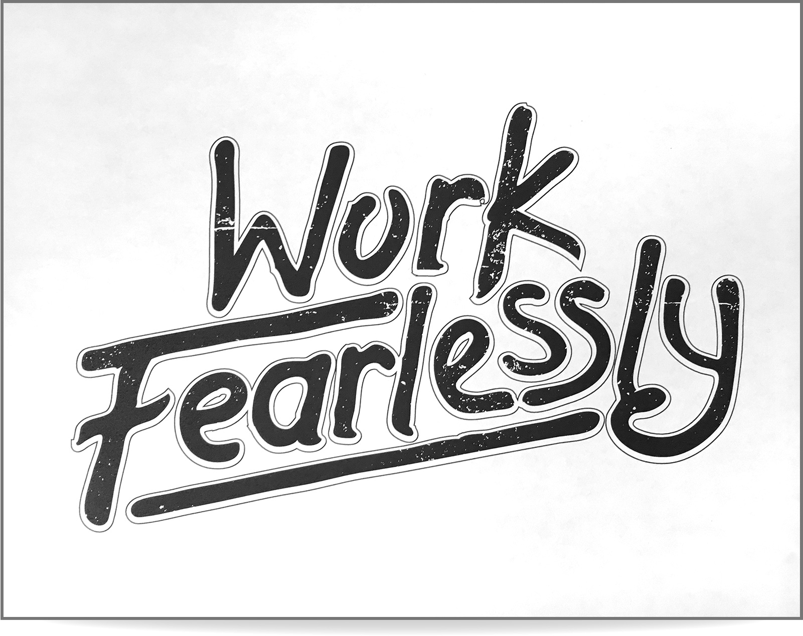
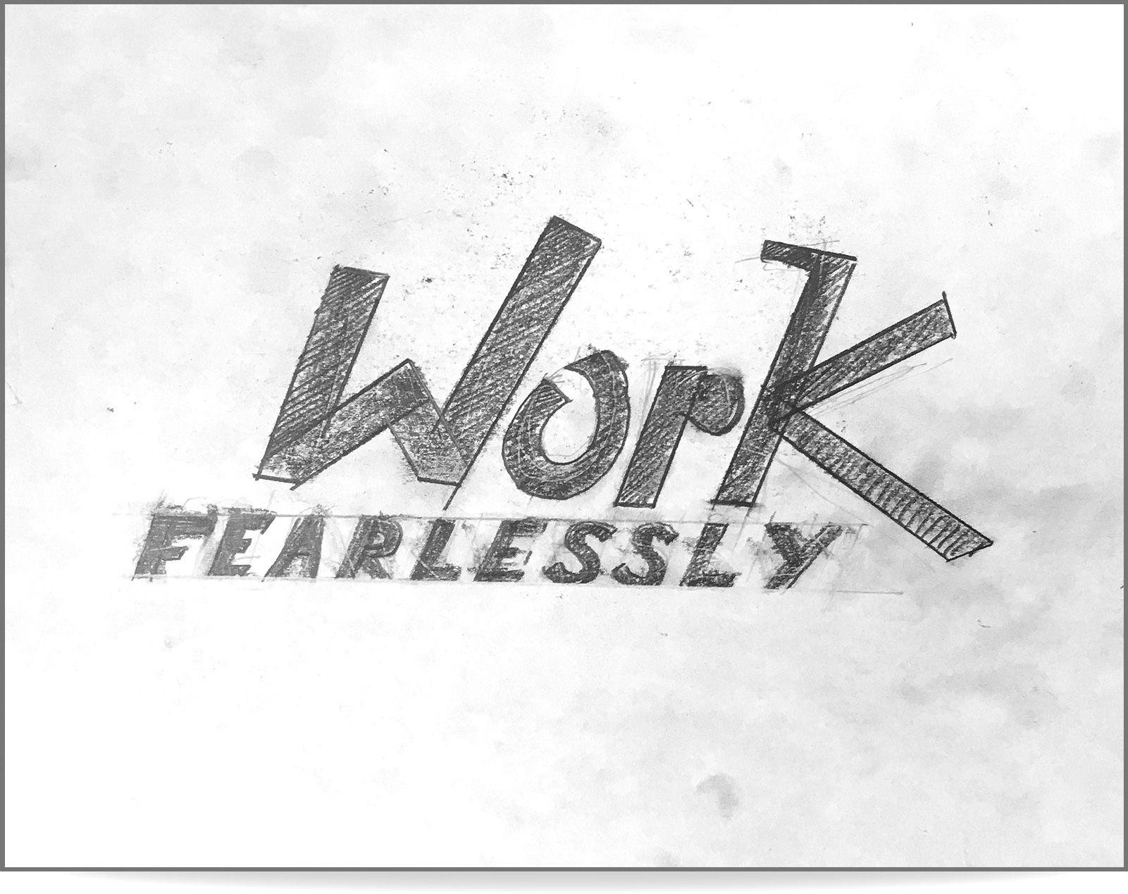
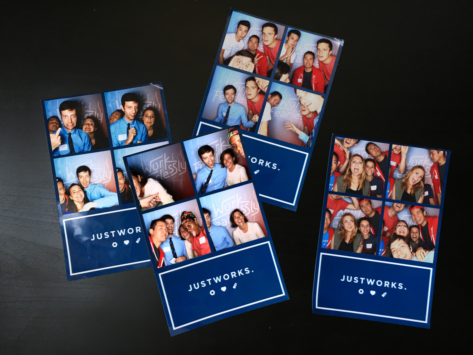
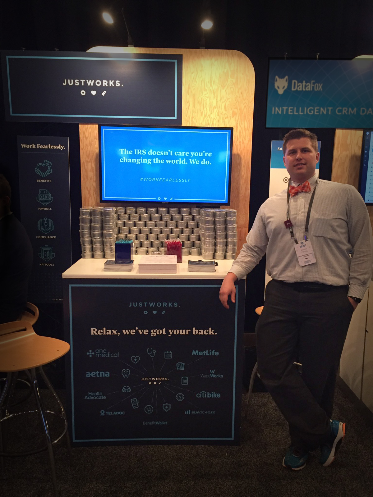
Work Fearlessly Branding
This was for a customer appreciation event that took place at Brooklyn Bowl. Below the t-shirt photos, you can see some of the sketches I made, as part of the design and lettering process for the primary graphic. The snapshots included below are from the ridiculous photo booth we had at the event.


Justworks Referral Program Postcards

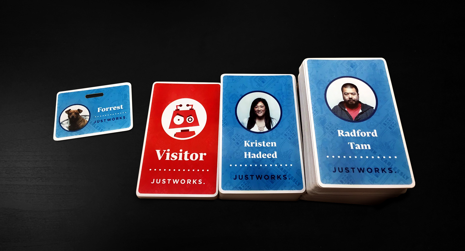
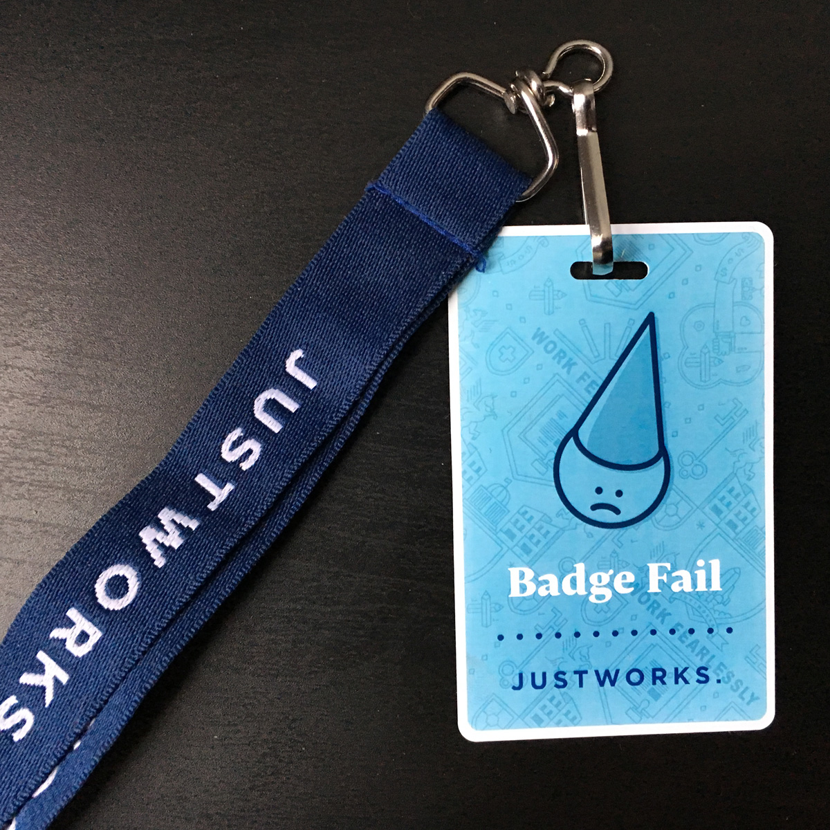
Security Badges and Lanyards
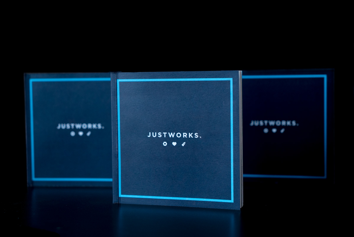
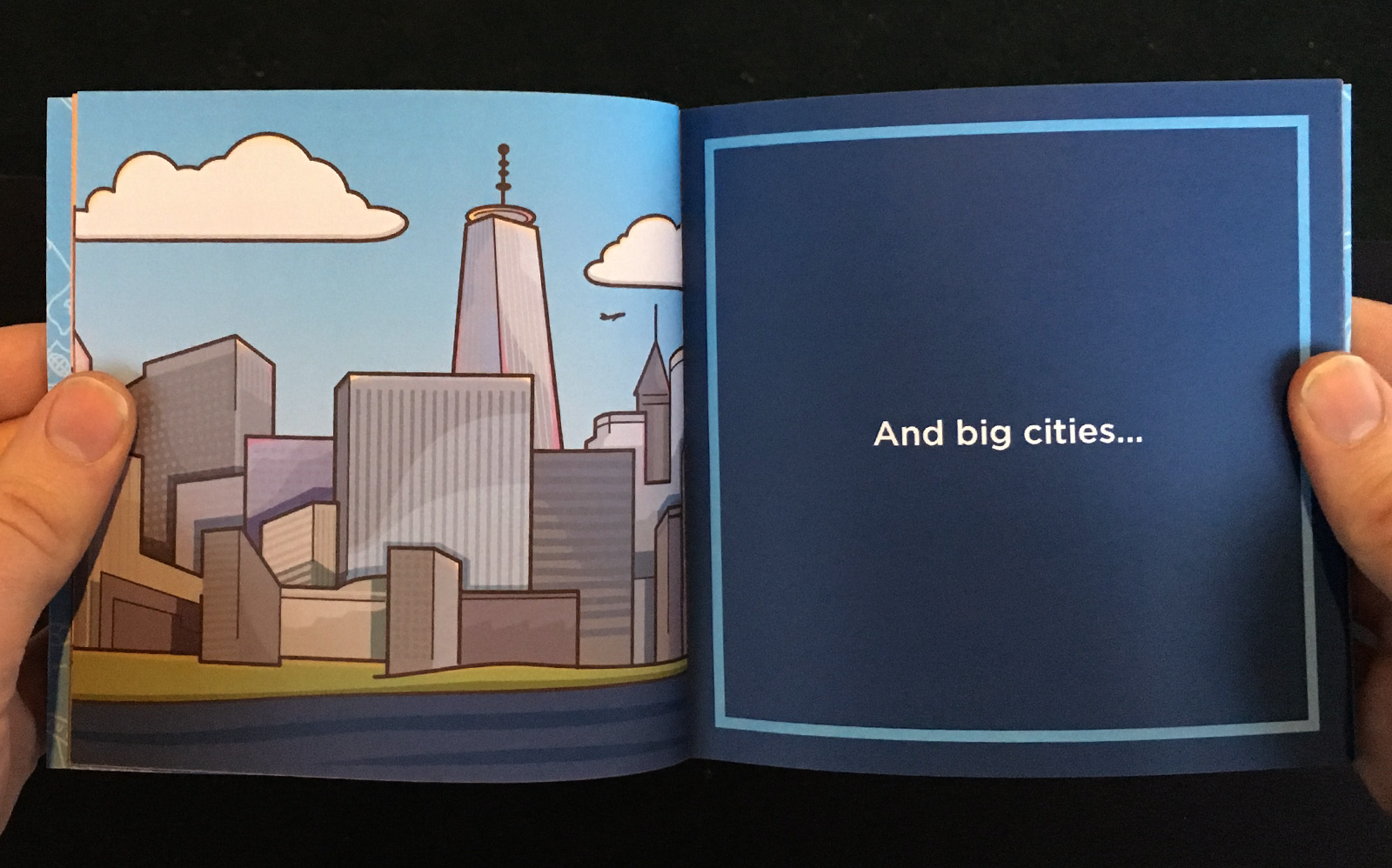
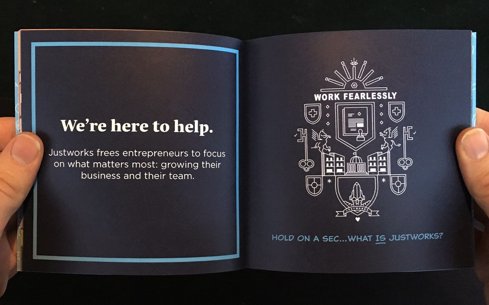
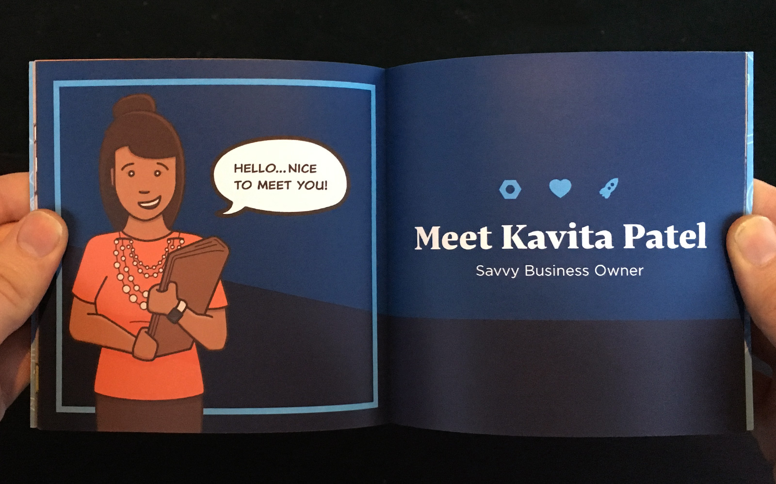
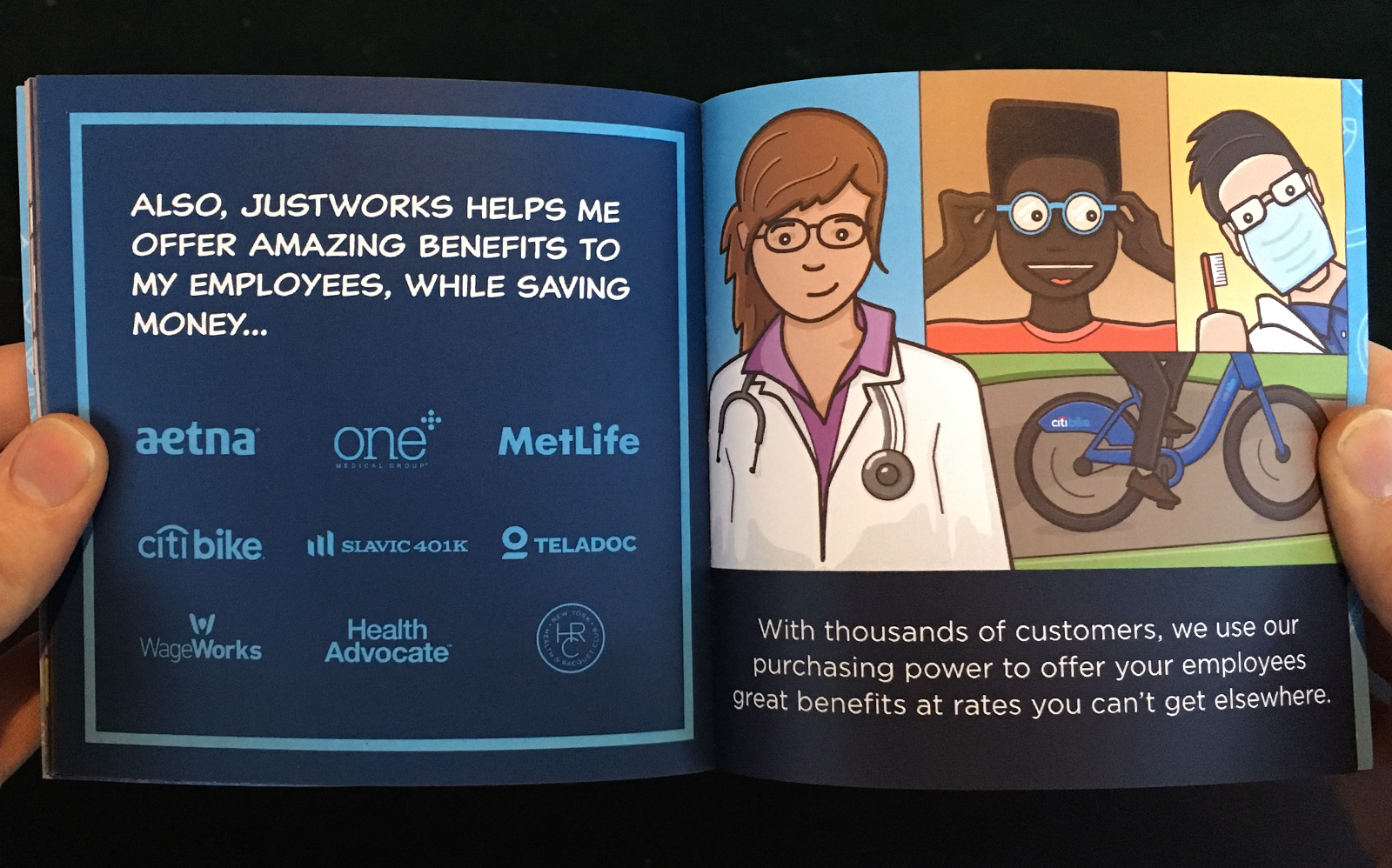
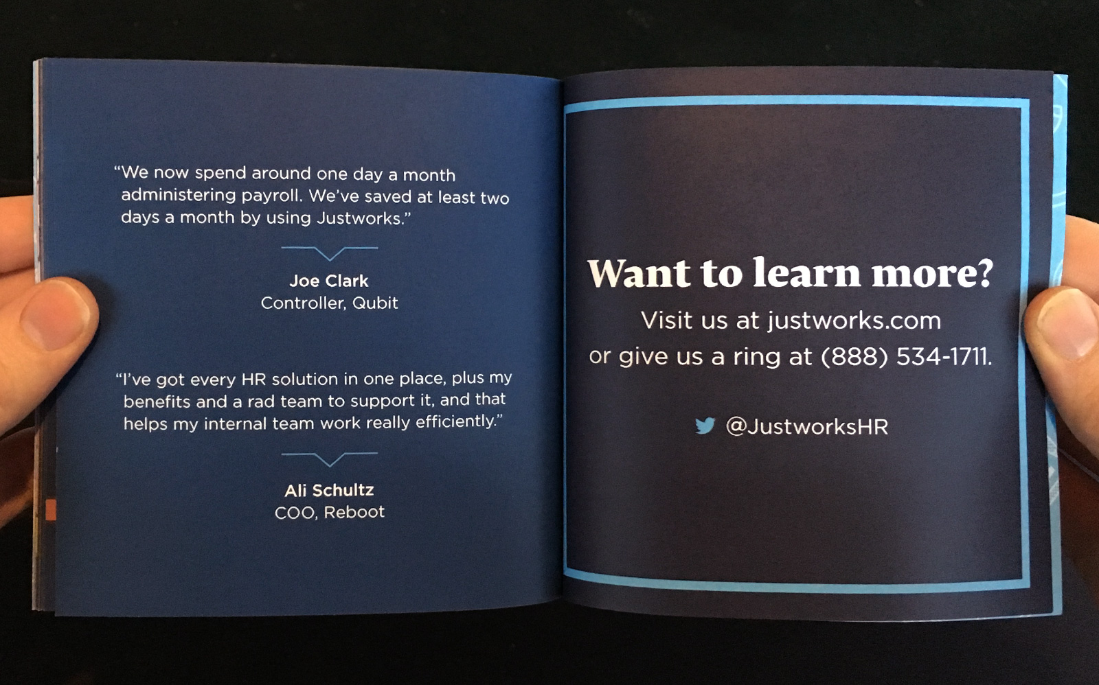
The Story of Justworks
This is a 28-page, 5-inch promotional item I designed and illustrated to introduce new customers to Justworks. We wanted to use storytelling to make the message more interesting and relatable to people who were not familiar with Justworks.
I pitched the concept, did all the design and illustration work, and wrote the story (which was adapted from a promotional video we had recently made). Throughout this process, I worked closely with our Director of Marketing and the Sales teams to make sure the messaging and tone were on target. The finished product was very well received both inside and outside the company, becoming one of the primary physical pieces of marketing used by the sales team.


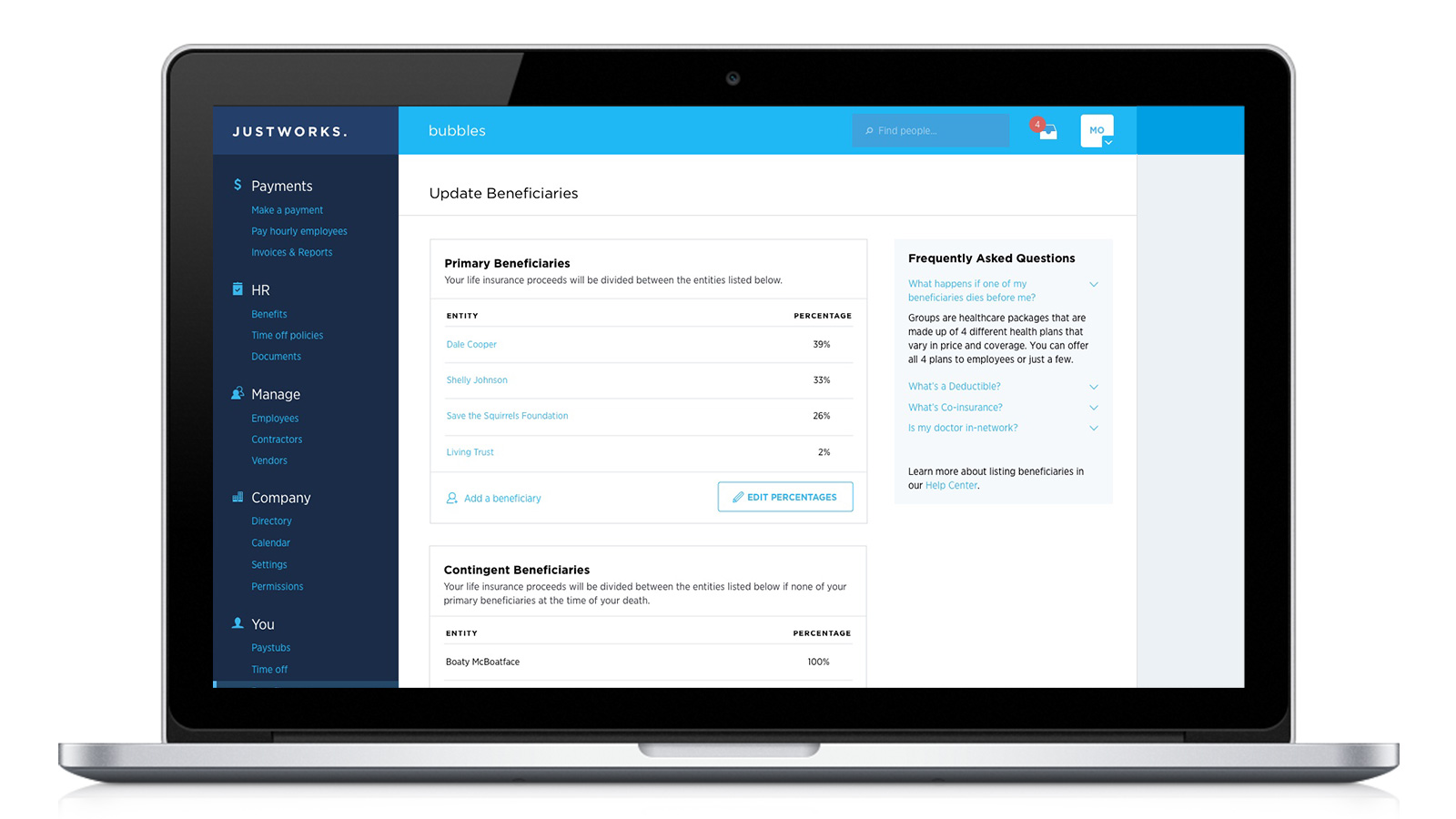
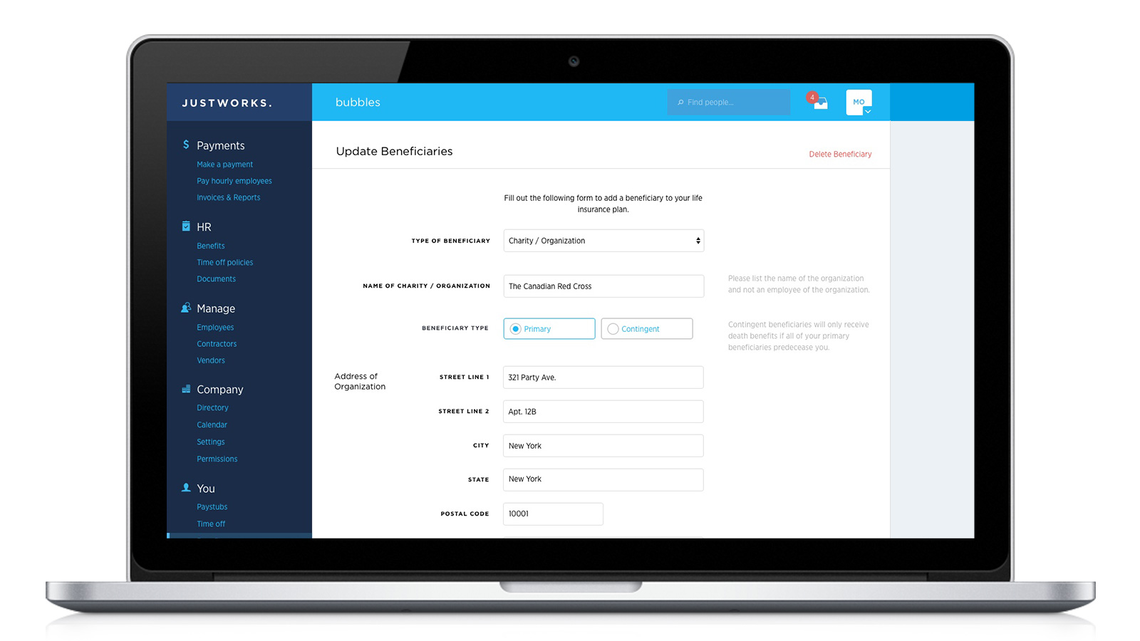
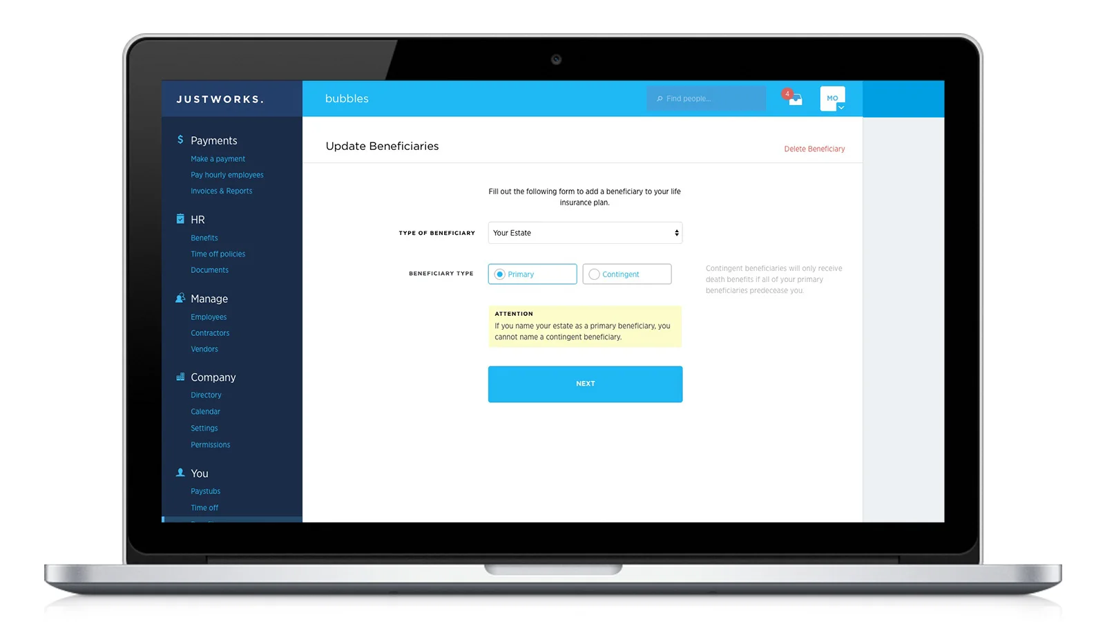
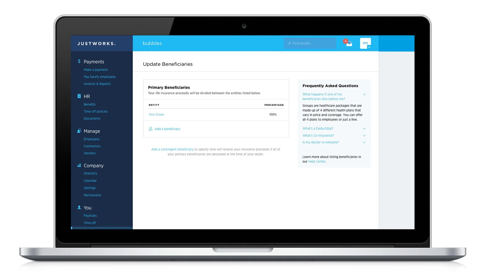
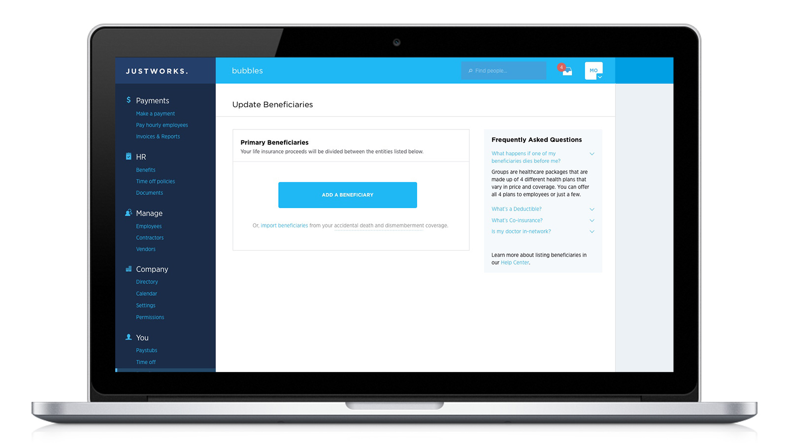
Adding Life Insurance Beneficiaries to the Justworks App
Justworks offers its customers the option of life and AD&D (accidental death and dismemberment) insurances for their employees through MetLife. However, the low-tech process for employees to specify a beneficiary for their policies was rather clunky – employees had to download a PDF form from MetLife, print and fill out the form, then scan and email the completed form back to Justworks. We wanted to improve the user experience by integrating this process into the app. I did the product design for this, working closely with the PM to meet all the feature requirements.


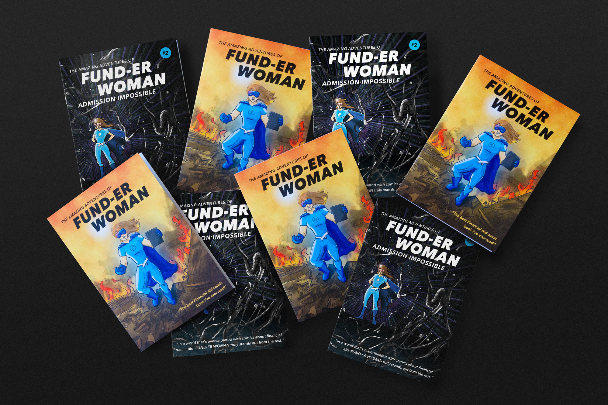
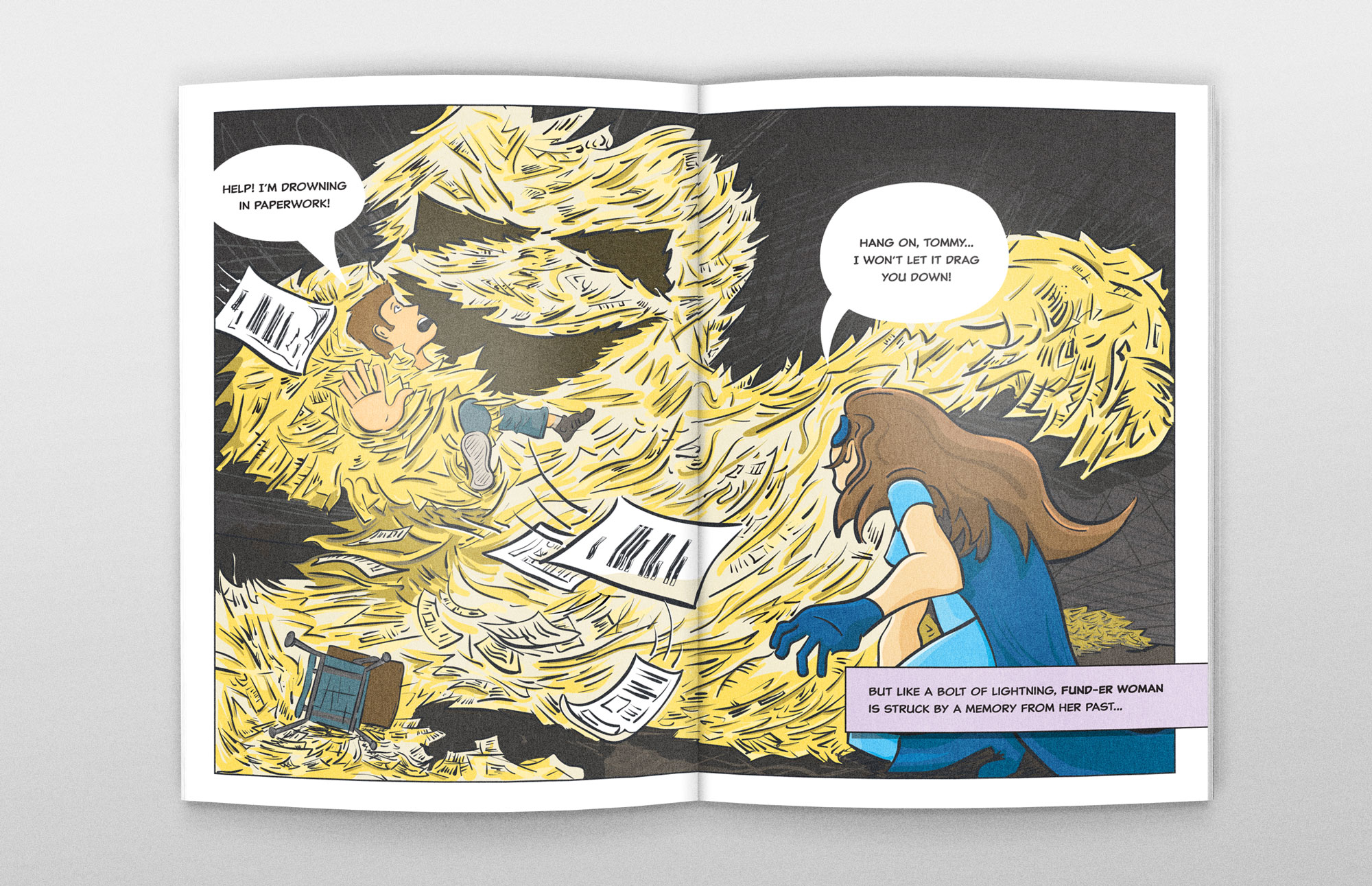
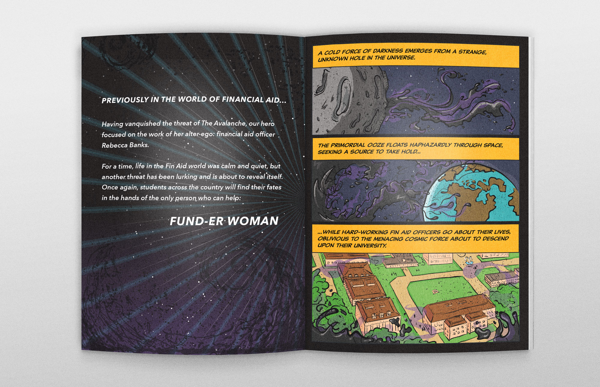
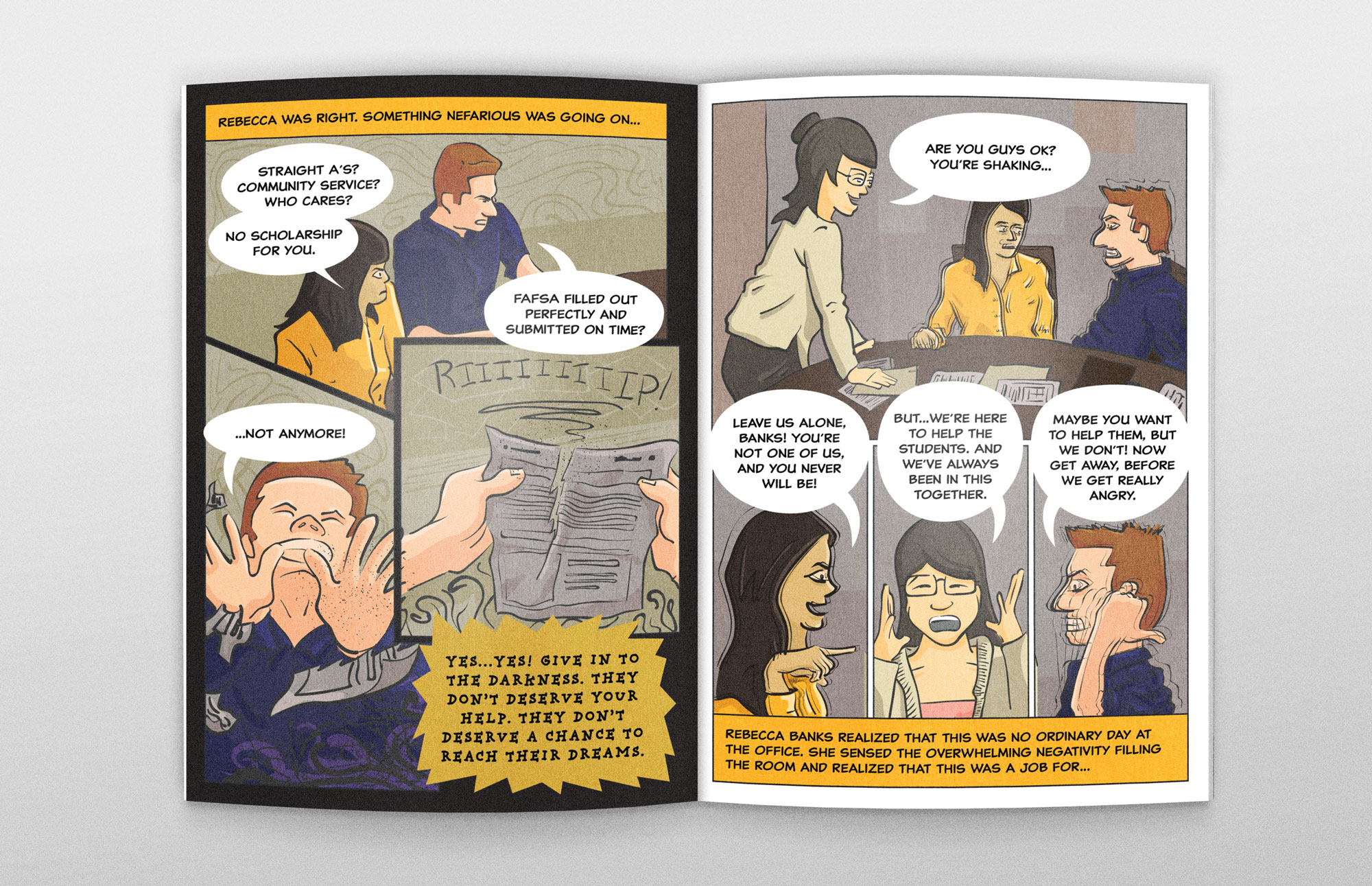
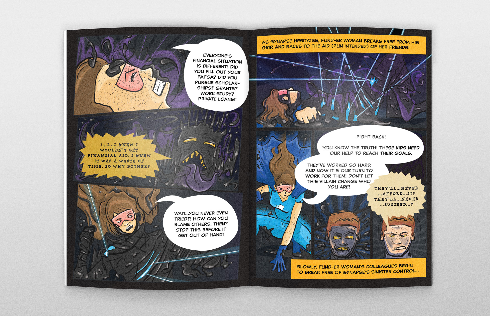
The Amazing Adventures of FUND-ER WOMAN
At CommonBond, we needed a way to emotionally connect with our audience of financial aid officers, and let them know how our in-school financial aid services can help students succeed in college. The challenge here was to get FinAid officers to connect with and remember our brand, without being able to call out specific product benefits and features, due to restrictions in the student loan industry. We needed to come up with a promotional piece that shows we understand financial aid officers – they are the super heroes of the college admissions process, making impossible dreams come true.
I pitched this idea for a comic book to my creative director and our director of in-school marketing. I did all the design and illustration work, while working collaboratively with a copywriter on the script.
The project was a huge success, and financial aid officers at conferences around the country would come up to our display table and clamor for more Fund-er Woman. The reaction was so positive that we created a second issue the next year.


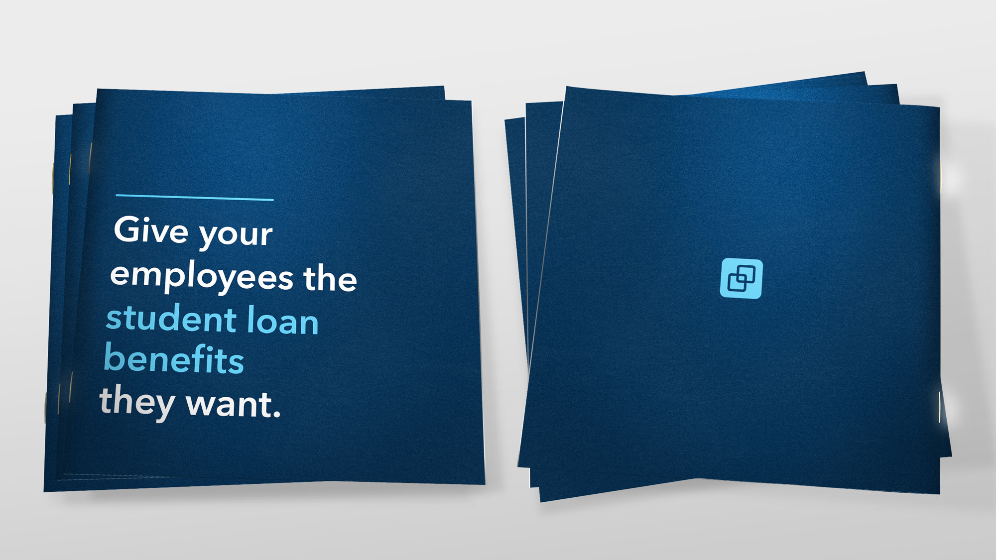
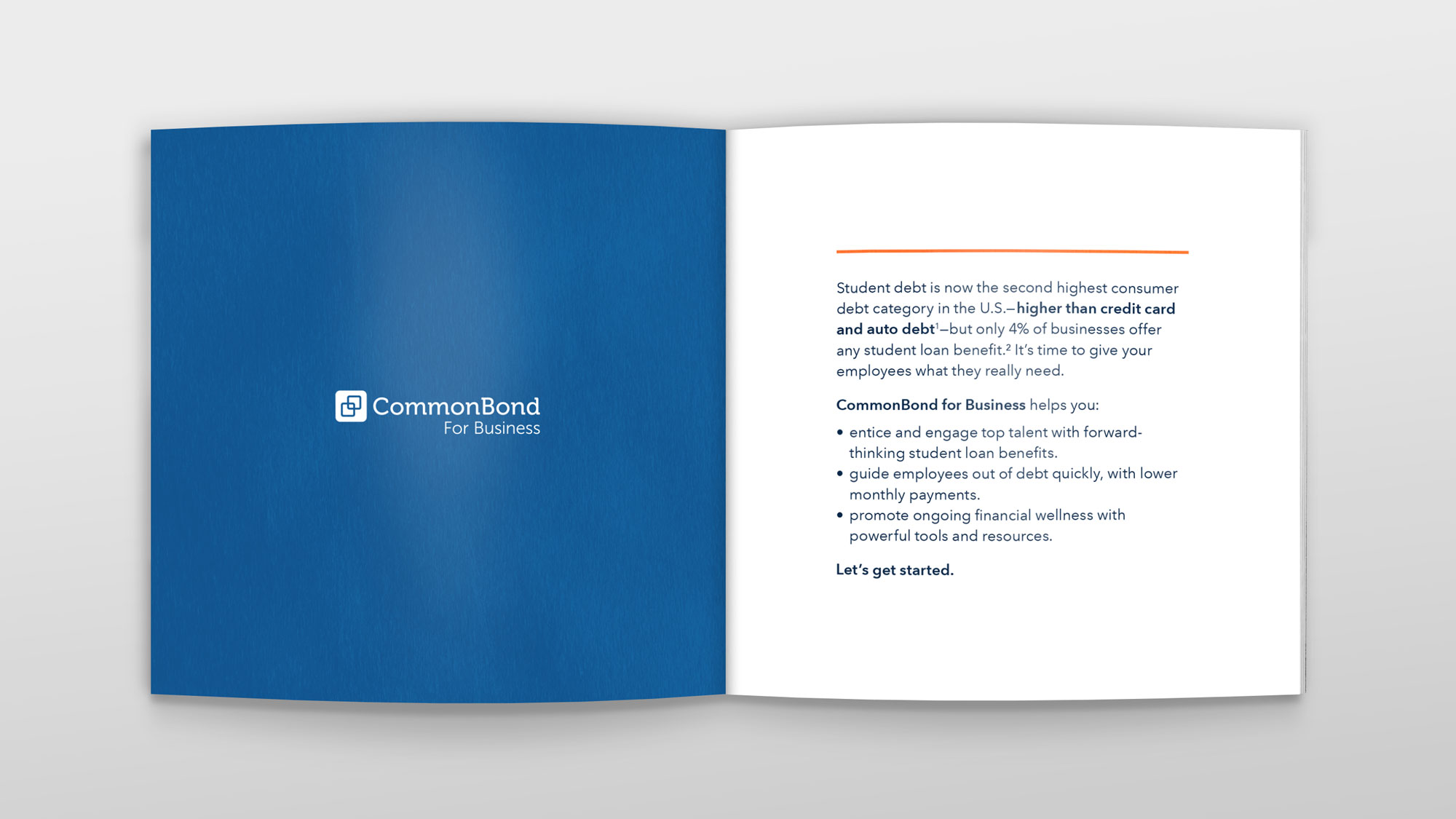
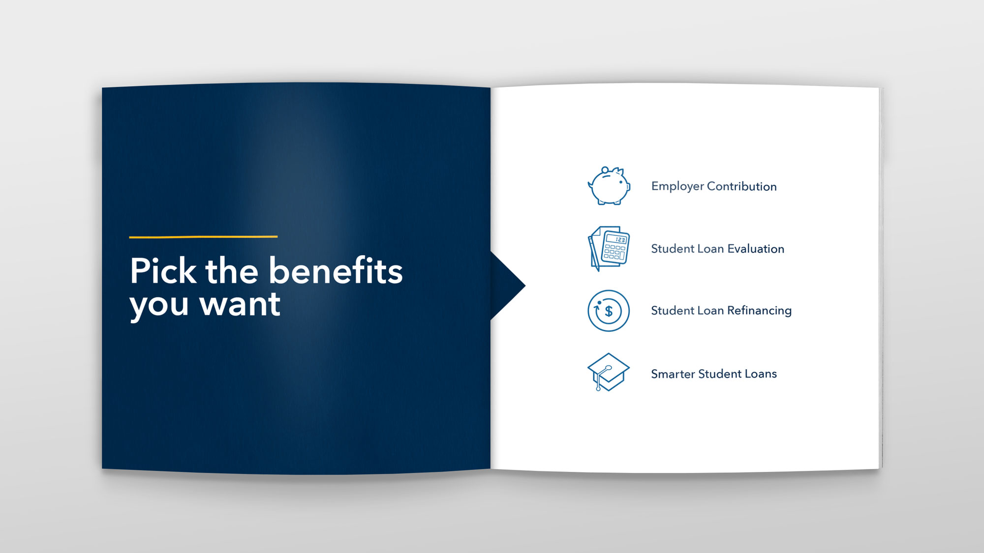
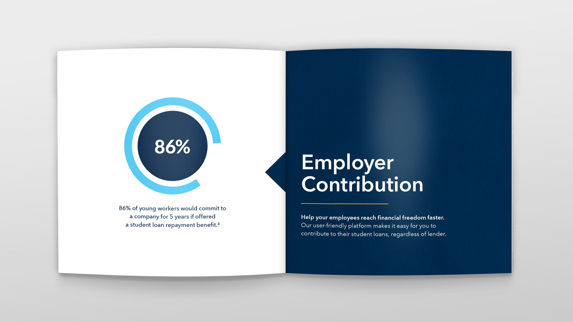
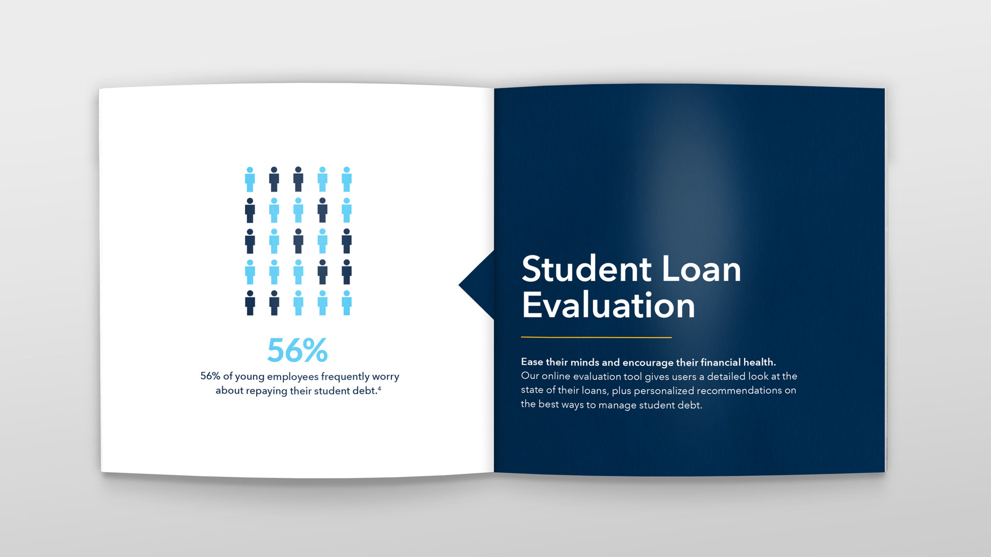
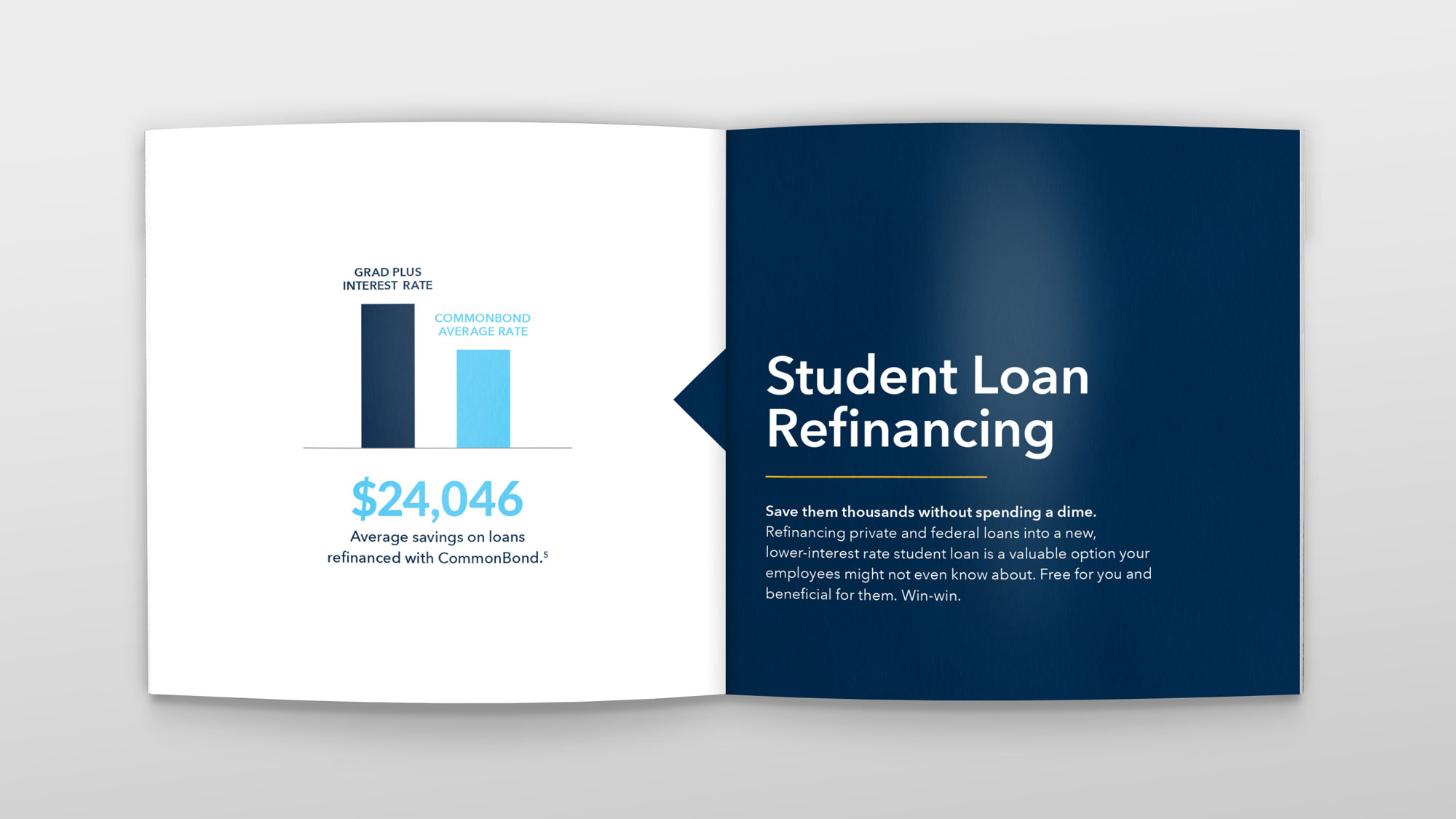
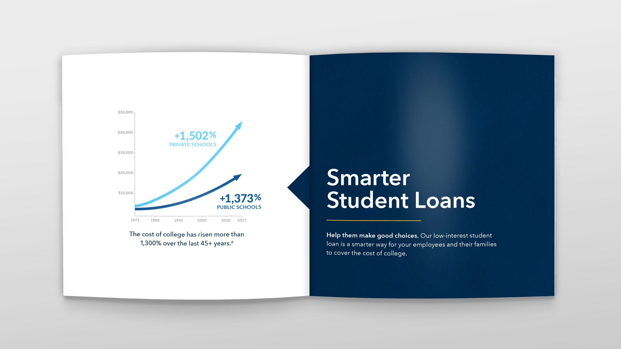
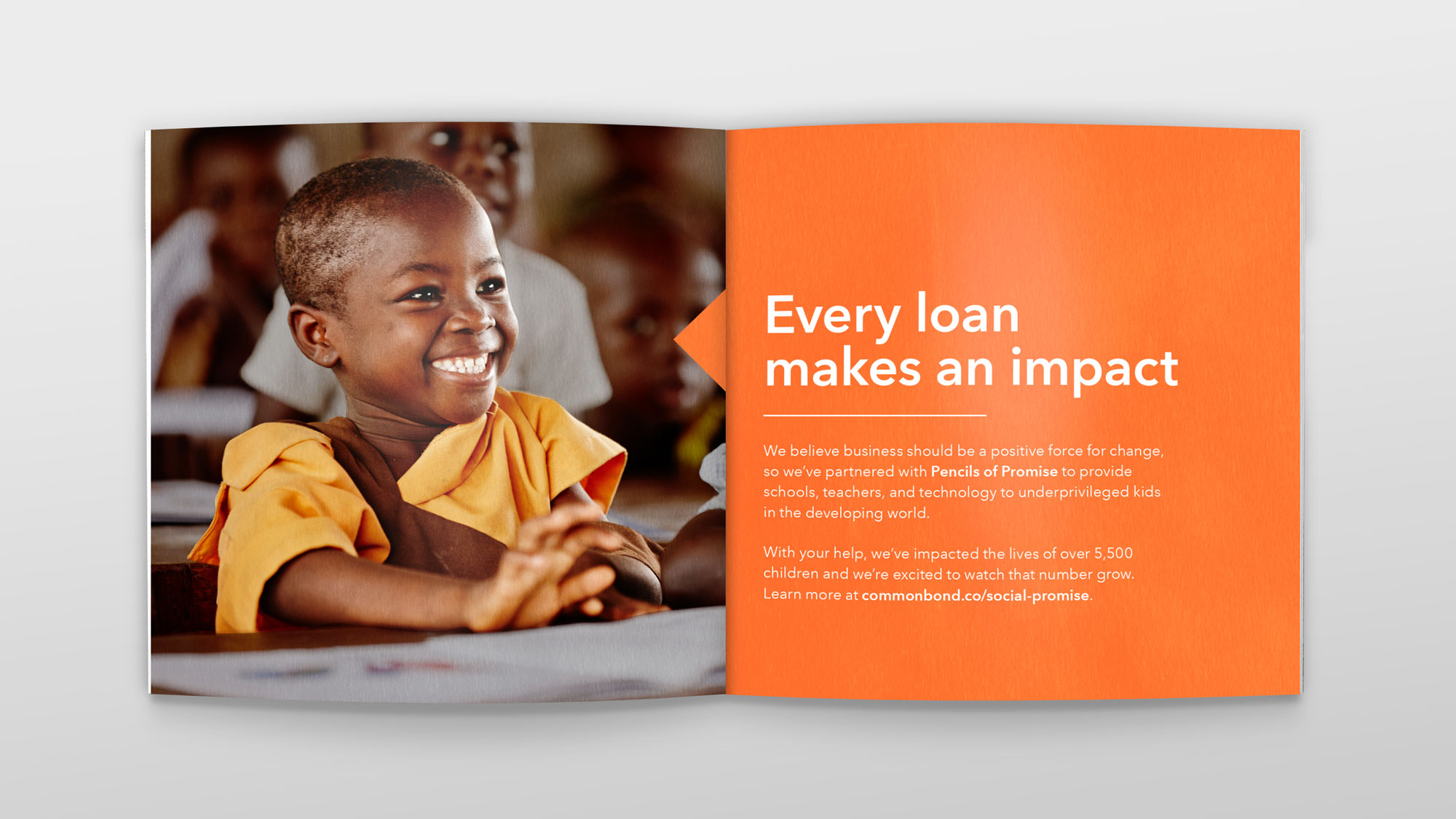
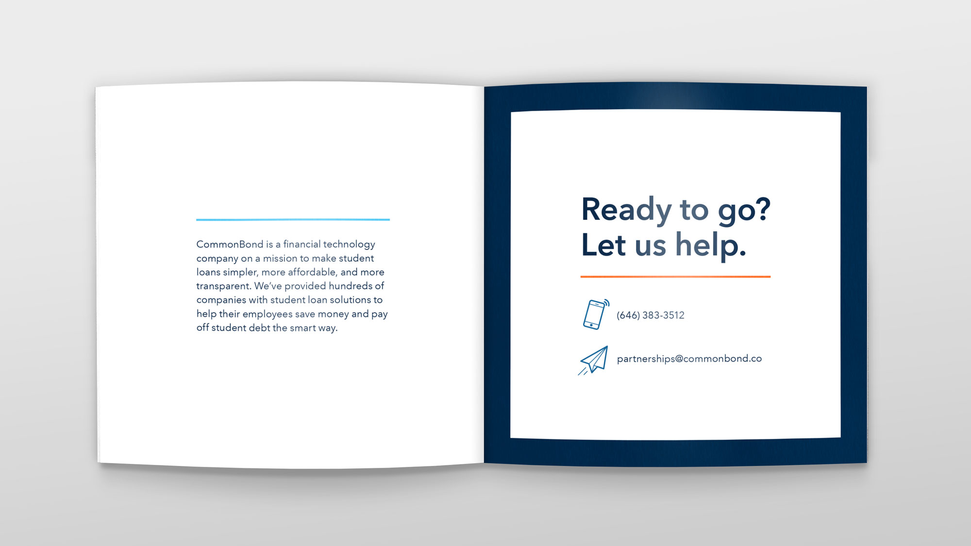
CommonBond for Business Brochure
CommonBond for Business is the B2B student loan benefit product at CommonBond. The old CB4B booklet was woefully outdated, and needed a fresh new update. I was the lead designer on this project, and worked closely with another designer and a copywriter to design this booklet.
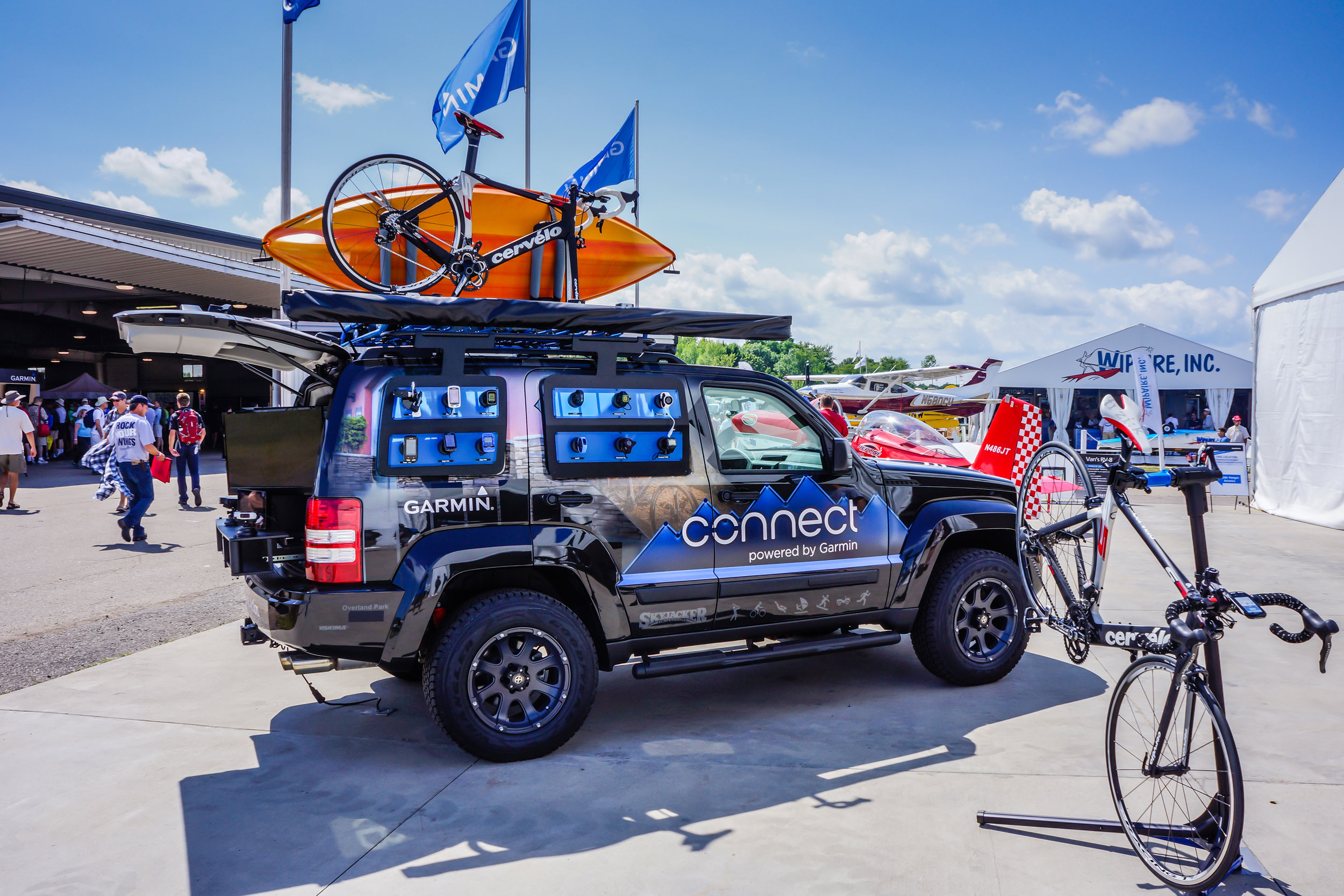
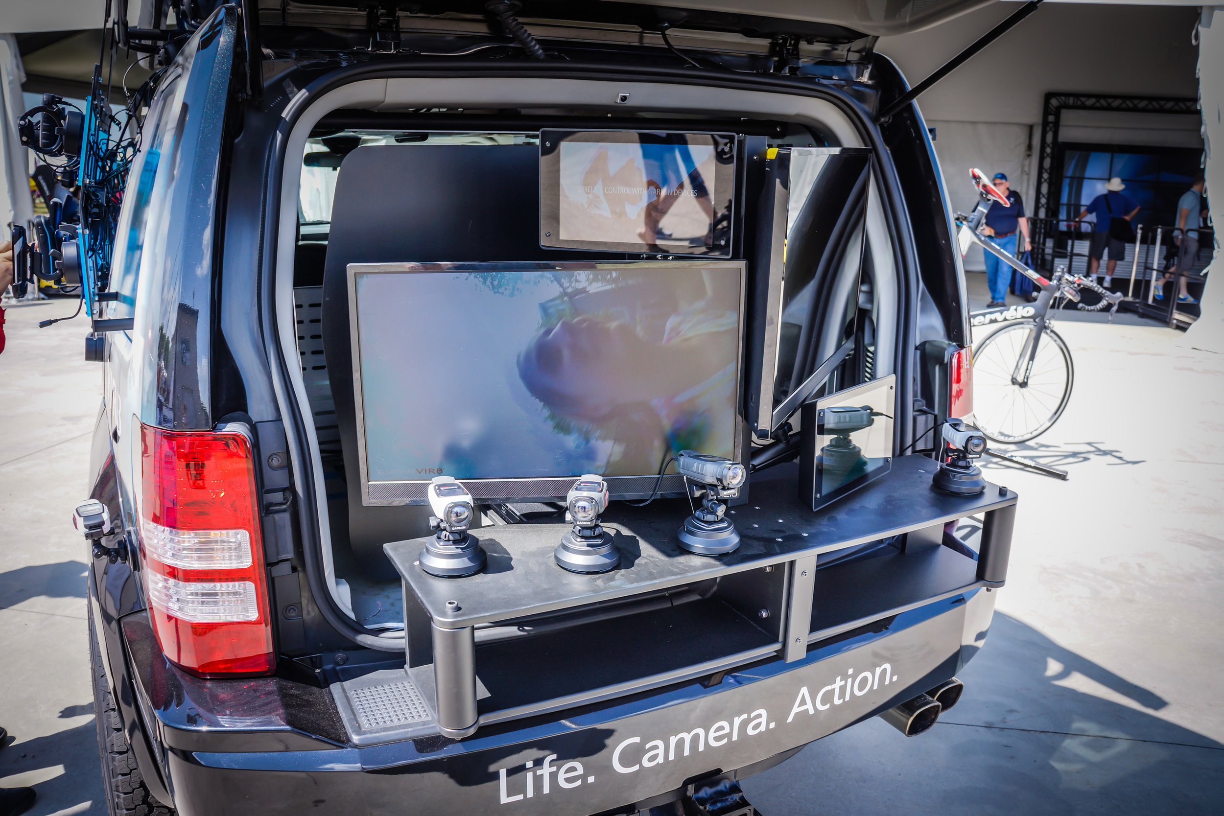
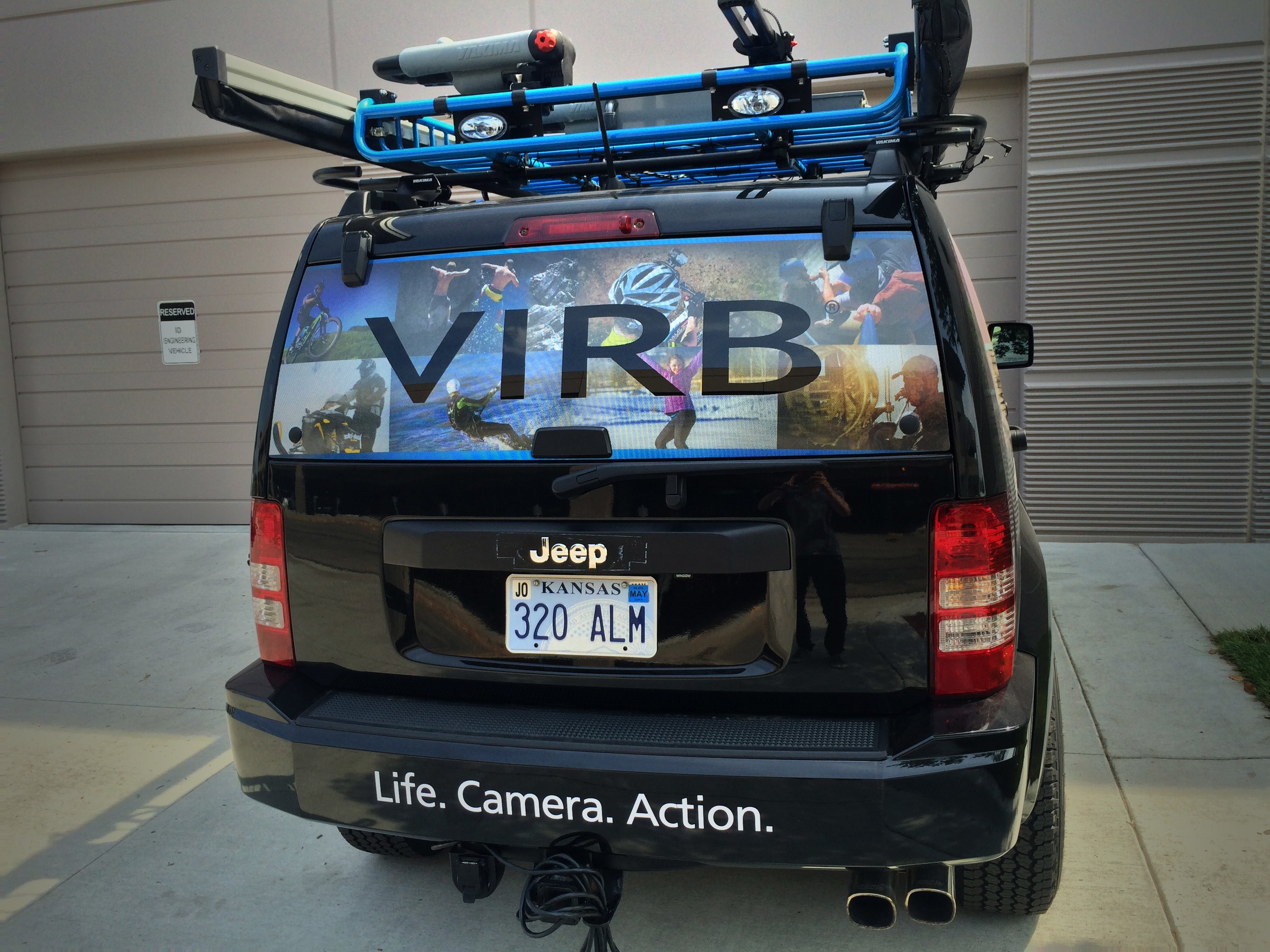
Garmin Jeep
I designed a branded Jeep wrap to be used at trade shows, showcasing the Garmin VIRB action camera and Garmin Connect – an online fitness community. I did the visual design, working closely with the Garmin industrial design team. The Jeep also has space on the sides to showcase other outdoor GPS devices. The back of the vehicle has a video console that slides out, showing video footage from the action camera.


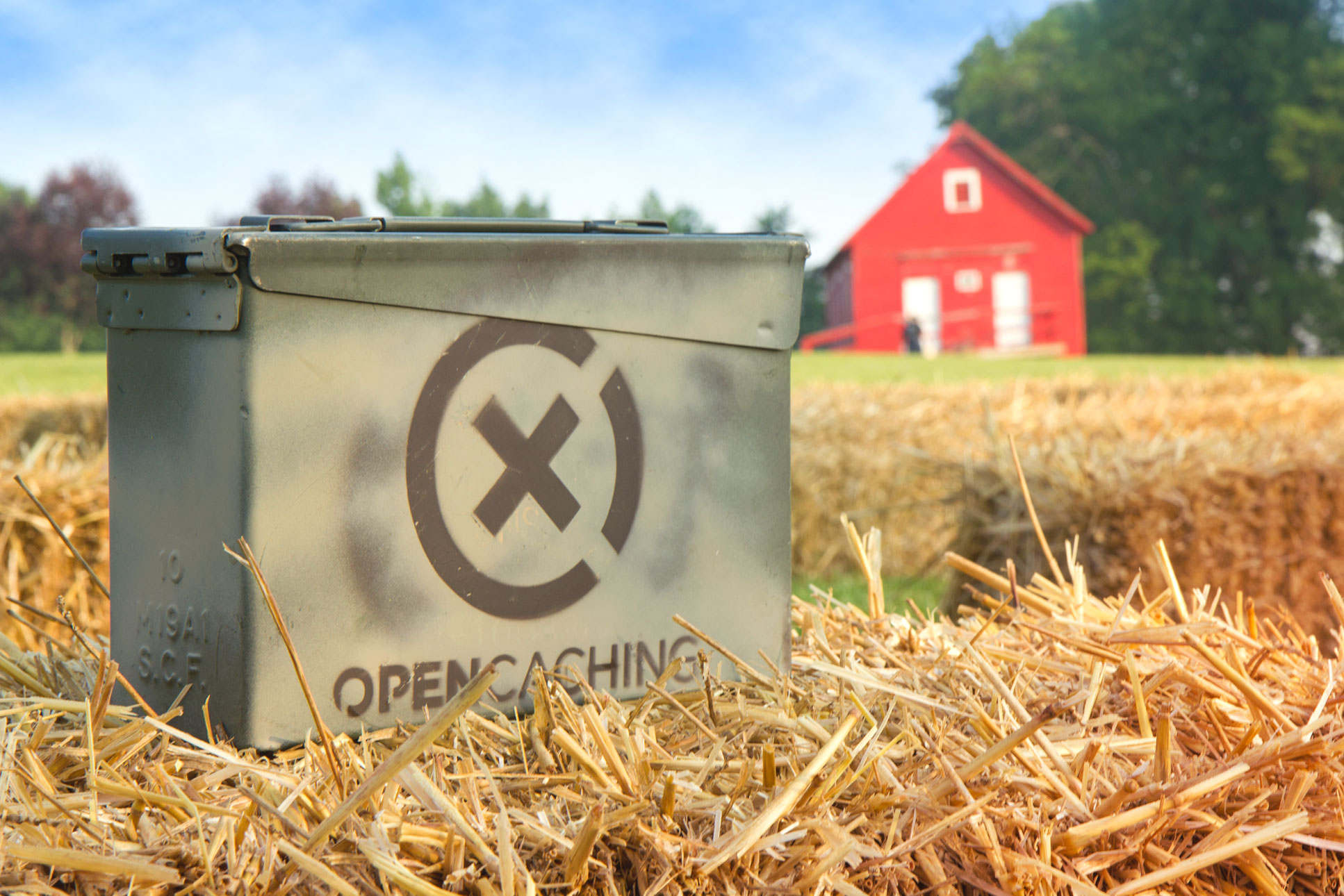
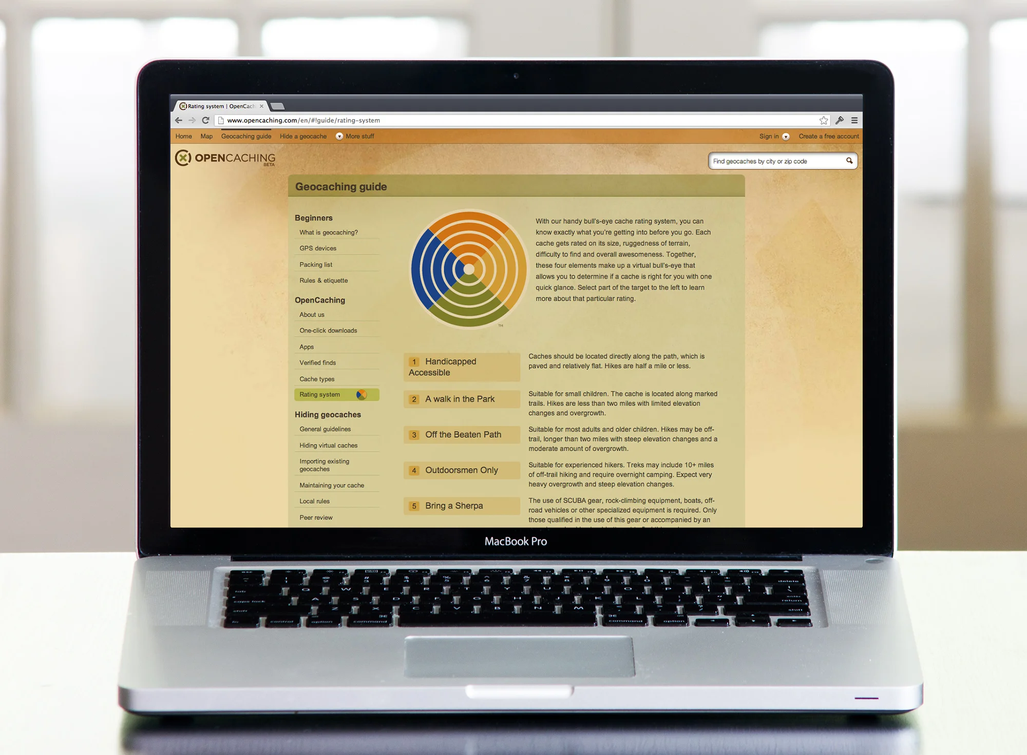
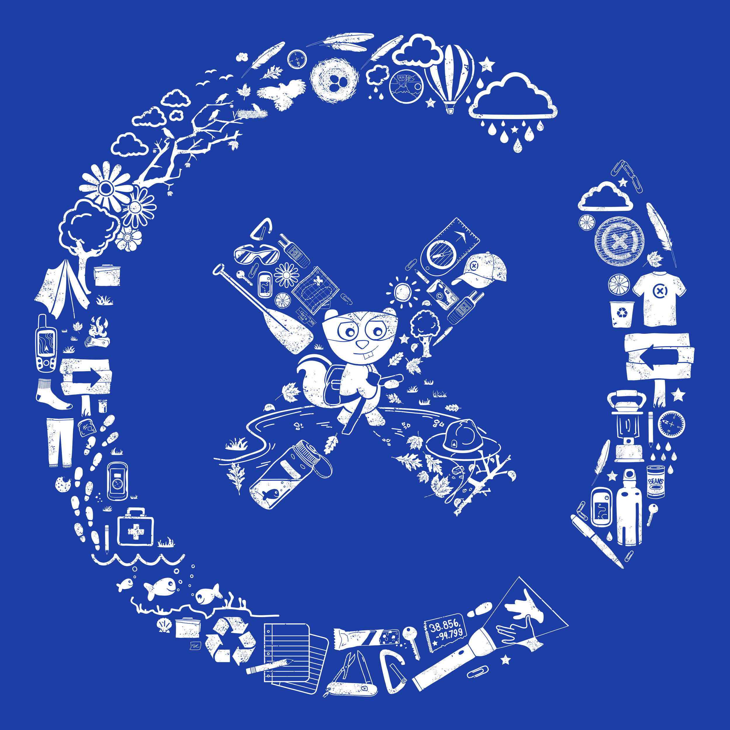
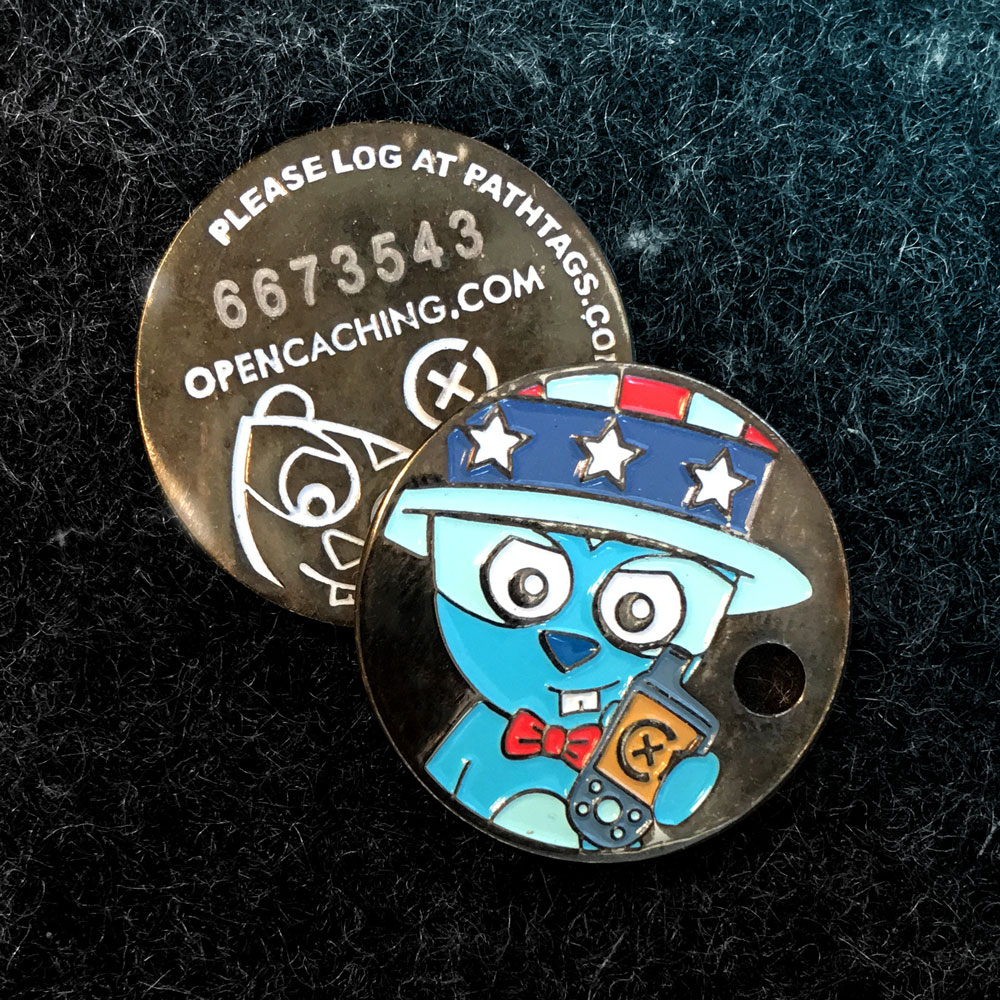
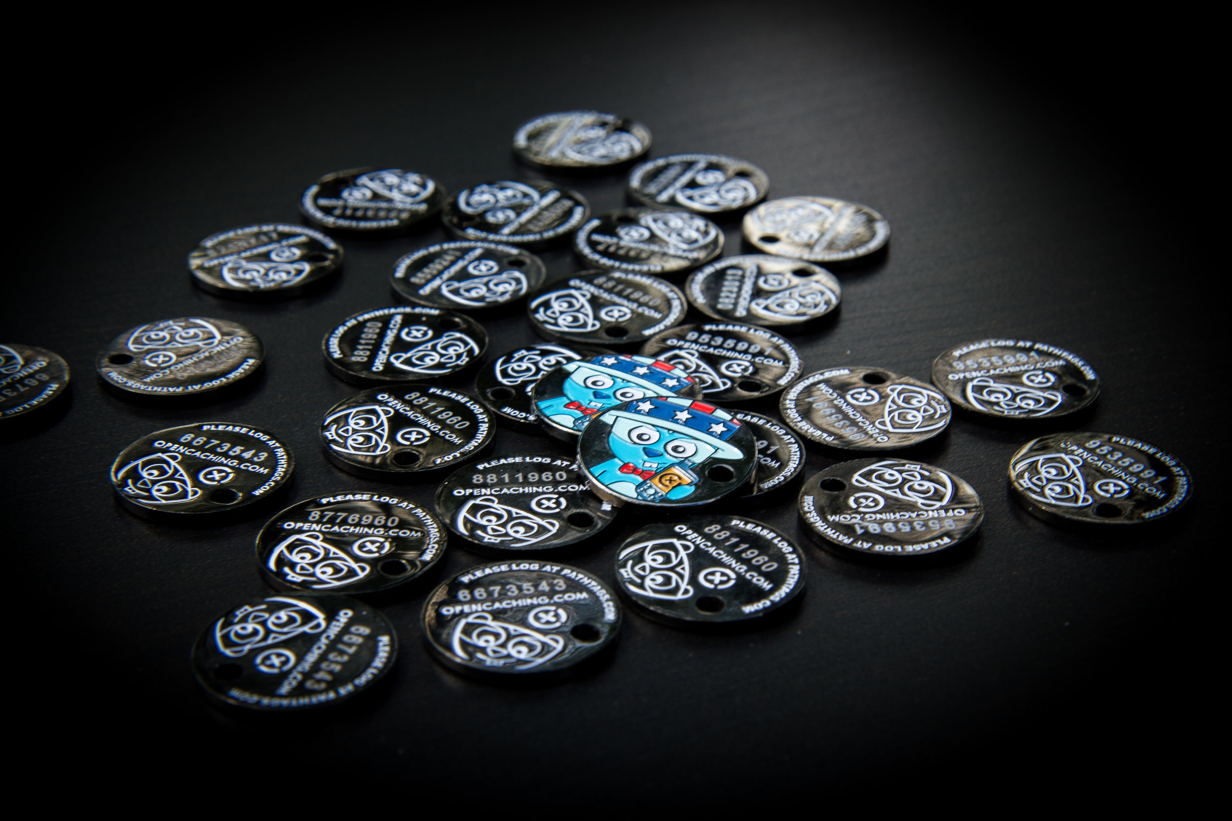
Garmin OpenCaching
OpenCaching is a geocaching brand I created for Garmin. I designed the entire brand from scratch. Some key components I worked on included a website for finding and logging geocaches, a mobile app, and a whole bunch of promotional items and marketing collateral. Additionally, I created a geocaching mascot (Opie the Chipmunk), as a way to appeal to kids and families.